

About
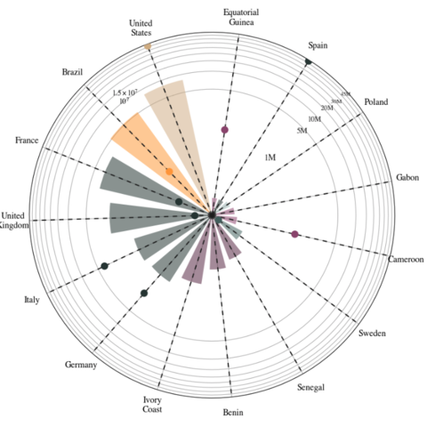
This plot is a circular bar plot. Let's see what the final output will look like:
As a teaser, here is the plot we’re gonna try building:
Libraries
For creating this chart, we will need a whole bunch of libraries!
import matplotlib as mpl
import matplotlib.pyplot as plt # plotting the chart
from matplotlib.cm import ScalarMappable # creating scalar mappable objects for color mapping
from matplotlib.lines import Line2D # creating custom lines
import matplotlib.patches as mpatches # customize graphical shapes and patches
from matplotlib.patches import Patch
from textwrap import wrap # countries name lisibility

import numpy as np # arrays and mathematical functions
import pandas as pd # data manipulation
from mpl_toolkits.axes_grid1.inset_locator import inset_axes # adding inset axes within a larger plot
Dataset
The data can be accessed using the url below.
url = 'https://raw.githubusercontent.com/holtzy/The-Python-Graph-Gallery/master/static/data/polar_data.csv'
df = pd.read_csv(url)
Create variables for the chart
To make the code clearer, we first create a first code chunk containing variable definitions, used later in the customization of the graph.
- We specify that we want to use the
Timesfont and that the color of the text is"#1f1f1f" - We define a custom color map (
cmap) using a list of color values. This color map will be used to map values to colors in our plot - We also create a normalizer to map data values to the range [0, 1], which corresponds to colors in our
cmap. In this case, we're using the'Cont_code'values fromdfto determine the color mapping range
# Set default font to Bell MT, Bell is the prettiest serif IMO
plt.rcParams.update({"font.family": "Times"})

# Set default font color to GREY12
plt.rcParams["text.color"] = "#1f1f1f"

# The minus glyph is not available in Bell MT
# This disables it, and uses a hyphen
plt.rc("axes", unicode_minus=False)

# Colors
COLORS = ['#914F76','#A2B9B6','tan','#4D6A67','#F9A03F','#5B2E48','#2B3B39']
cmap = mpl.colors.LinearSegmentedColormap.from_list("my color", COLORS, N=7)

# Normalizer
NUMBERS = df['Cont_code'].values
norm = mpl.colors.Normalize(vmin= NUMBERS.min(), vmax= NUMBERS.max())
COLORS = cmap(norm(NUMBERS))
Creating the chart
The chart is displayed in polar coordinates, which means it's a circular chart with bars extending radially from the center.
- It sets up a polar plot with a white background and adjusts some plot properties like the angle offset, y-axis scale, and labels.
- It adds bars representing the number of Spanish learners in various countries, where the angle of each bar corresponds to the country's position on the circle.
- Dashed vertical lines are added as references.
- Dots are added to represent the mean gain of native Spanish speakers in those countries
- Country names are wrapped for better readability, and labels for the regions are set on the x-axis
- Titles, a scale, and credit/sources information are added to the chart
- Finally, a legend is included to explain the color coding used in the chart
# Initialize layout in polar coordinates
fig, ax = plt.subplots(figsize=(7, 12.6), subplot_kw={"projection": "polar"})

# Set background color to white, both axis and figure.
fig.patch.set_facecolor("white")
ax.set_facecolor("white")

ax.set_theta_offset(1.2 * np.pi / 2)
ax.set_ylim(0, 45000000)
ax.set_yscale('symlog', linthresh=500000)

# Add bars
ANGLES = np.linspace(0.05, 2*np.pi - 0.05, len(df), endpoint = False)
LENGTHS = df['Students'].values
ax.bar(ANGLES, LENGTHS,
       color=COLORS, alpha=0.5,
       width=0.3, zorder=11,
       label='Spanish Learners')

# Add dashed vertical lines. These are just references
ax.vlines(ANGLES, 0, 45000000, color="#1f1f1f", ls=(0, (4, 4)), zorder=11)

# Add dots to represent the mean gain
MEAN_GAIN = df['Natives'].values
ax.scatter(ANGLES, MEAN_GAIN, s=80, color= COLORS, zorder=11, label = 'Native Spanish Speakers')

# Add labels for the regions
REGION = ["\n".join(wrap(r, 5, break_long_words=False)) for r in df['Country'].values]

# Set the labels
ax.set_xticks(ANGLES)
ax.set_xticklabels(REGION, size=12)
ax.set_yticks(np.arange(0,45000000,
                        step=5000000))

# Add title and subtile at the top of the chart
plt.suptitle('Top Countries with Spanish Learners',
             size = 20, y = 0.95)
plt.title('And their Native Spanish Speaking Population',
          style = 'italic', size = 14, pad = 85)

# Add scale starting at 1M and ending at 45M
PAD = 10
ax.text(-0.75 * np.pi / 2, 1000000 + PAD, "1M", ha="right", size=12)
ax.text(-0.75 * np.pi / 2, 5000000 + PAD, "5M", ha="right", size=11)
ax.text(-0.75 * np.pi / 2, 10000000 + PAD, "10M", ha="right", size=10)
ax.text(-0.75 * np.pi / 2, 20000000 + PAD, "20M ", ha="right", size=9)
ax.text(-0.75 * np.pi / 2, 30000000 + PAD, "30M ", ha="right", size=8)
ax.text(-0.75 * np.pi / 2, 46000000 + PAD, "45M ", ha="right", size=7)
XTICKS = ax.xaxis.get_major_ticks()
for tick in XTICKS:
    tick.set_pad(12)

# Add credit and sources
caption = "\n".join(["Created adapting a tutorial from Yan Holtz: https://python-graph-gallery.com/web-circular-barplot-with-matplotlib/",
                     "Data compiled from various sources including:",
                     "https://www.statista.com/statistics/991020/number-native-spanish-speakers-country-worldwide/",
                     "https://cvc.cervantes.es/lengua/espanol_lengua_viva/pdf/espanol_lengua_viva_2022.pdf",
                     "https://www.wordspath.com/spanish-speaking-countries-in-europe/#:~:text=More%20than%2084%20million%20people,them%20are%20native%20Spanish%20speakers."
])
fig.text(0, 0.1, caption, fontsize=10, ha="left", va="baseline")

# First, make some room for the legend and the caption in the bottom.
fig.subplots_adjust(bottom=0.175)

# Add customed legend
legend_elements = [Line2D([0], [0], marker='o', color='w', label='Native Spanish Speaking Population',
                          markerfacecolor='gray', markersize=12),
                          Line2D([0],[0] ,color = 'lightgray', lw = 3, label = 'Spanish Learners'),
                          mpatches.Patch(color='tan', label='North America', alpha = 0.8),
                          mpatches.Patch(color='#F9A03F', label='South America', alpha = 0.8),
                          mpatches.Patch(color='#2B3B39', label='West Europe', alpha = 0.8),
                          mpatches.Patch(color='#914F76', label='West Africa', alpha = 0.8),
                          mpatches.Patch(color='#914F76', label='Central Africa', alpha = 0.8),
                          mpatches.Patch(color='#4D6A67', label='North Europe', alpha = 0.8),
                          mpatches.Patch(color='#A2B9B6', label='East Europe', alpha = 0.8)]
ax.legend(handles=legend_elements,
          loc='upper right', # location
          bbox_to_anchor=(1.4, 1), # shift the legend
          fontsize = 'small')

# Display the final chart
plt.show()
Going further
This article explains how to reproduce a line chart with small multiples, originally design by Gilbert Fontana.
For more examples of advanced customization, check out this other reproduction of Fontana's work. Also, you might be interested in adding an image/logo to your chart.


