

About
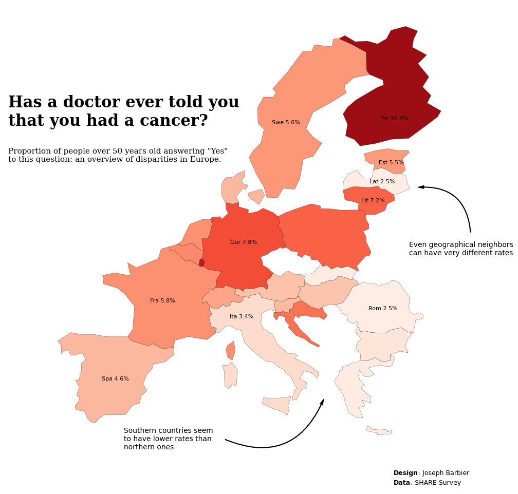
This plot is a Choropleth map. It shows the cancer rate per country is various European countries using the SHARE Survey data.
The chart was made by Joseph B.. Thanks to him for accepting sharing his work here!
Let's see what the final picture will look like:
Libraries
First, you need to install the following librairies:
- matplotlib is used for creating the chart and add customization features
- pandas and
geopandasare used to put the data into a dataframe and manipulate geographical data
And that's it!
# plot
import matplotlib.pyplot as plt
import matplotlib.cm as cm
import matplotlib.colors as mcolors
import matplotlib.patches as patches
from highlight_text import fig_text

# data
import pandas as pd
import geopandas as gpd
Dataset
For this reproduction, we're going to retrieve the data directly from the gallery's Github repo. This means we just need to give the right url as an argument to pandas' read_csv() function to retrieve the data.
The dataset contains one row per country and the associated cancer rate.
# Open the dataset from Github
url = "https://raw.githubusercontent.com/holtzy/the-python-graph-gallery/master/static/data/cancer_rate.csv"
cancer_rates = pd.read_csv(url)
Get map positions
Since our dataset contains only the country name and the cancer rate, we need to find a way to get actual country shape to put in our plot. For this we need to load a mapping dataset that you can get at Natural Earth Data (Download countries button). Then unzip it and get the .shp file and load it.
# world map (Replace with your path)
world = gpd.read_file(
    "../../static/data/ne_110m_admin_0_countries/ne_110m_admin_0_countries.shp")

# filter on europe only
europe = world[world['CONTINENT'] == 'Europe']
Once we get that file, we need to merge it with our actual dataset:
data = europe.merge(cancer_rates, how='left',
                    left_on='NAME', right_on='Country')
data.dropna(subset=['Cancer'], inplace=True)
data['Cancer'] = round(data['Cancer']*100, 1)
Background map
Thanks to the geopandas library, we can easily add a background map to our plot. We just need to call the plot() function on our geo dataframe.
With just a few lines of code, we can create a syntetic map that shows a European map.
# initialize the figure
fig, ax = plt.subplots(1, 1, figsize=(8, 8))

# create the plot
data.plot(ax=ax)

# custom axis
ax.set_xlim(-15, 35)
ax.set_ylim(32, 72)

# display the plot
plt.tight_layout()
plt.show()
Custom the axis
When we create map, we are generally not interested in the axis because the map itself contains all the information. For this, we use the axis('off') function to remove the axis.
# initialize the figure
fig, ax = plt.subplots(1, 1, figsize=(8, 8))

# create the plot
data.plot(ax=ax)

# custom axis
ax.set_xlim(-15, 35)
ax.set_ylim(32, 72)
ax.axis('off')

# display the plot
plt.tight_layout()
plt.show()
Color the map
In this chart, the color of the country will be used to display the value of the rate. For that we need to use a colormap. In our case, we will also normalize it, meaning that we will use a color gradient that goes (more or less) from the minimum to the maximum value of our dataset. This ensures that the color is representative of the data.
For this, we use the:
- add a
columnargument to specify the column to use for the color cmapargument (we will use a white to red gradient)vminandvmaxarguments to set the color scale limits
# initialize the figure
fig, ax = plt.subplots(1, 1, figsize=(8, 8))

# define colors
cmap = cm.Reds
min_rate, max_rate = 2, 12
norm = mcolors.Normalize(vmin=min_rate, vmax=max_rate)

# create the plot
data.plot(column='Cancer', cmap=cmap, norm=norm, ax=ax)

# custom axis
ax.set_xlim(-15, 35)
ax.set_ylim(32, 72)
ax.axis('off')

# display the plot
plt.tight_layout()
plt.show()
It's already looking better!
Custom other colors
What makes a map look good is not the only the color of the countries, but also adding a thin border to each country. This is also a way of illustrating the lack of data for some countries.
This is done with:
- the
edgecolorargument for the color - the
linewidthargument for the width
# initialize the figure
fig, ax = plt.subplots(1, 1, figsize=(8, 8))

# define colors
cmap = cm.Reds
min_rate, max_rate = 2, 12
norm = mcolors.Normalize(vmin=min_rate, vmax=max_rate)

# create the plot
data.plot(column='Cancer', cmap=cmap, norm=norm,
          edgecolor='black', linewidth=0.2, ax=ax)

# custom axis
ax.set_xlim(-15, 35)
ax.set_ylim(32, 72)
ax.axis('off')

# display the plot
plt.tight_layout()
plt.show()
Annotations
Annotations is probably the most important part of nice visualizations! Unfortunately, it's also a part that takes a lot of time and code 😅.
Add country names
In this code, we'll automate adding the country name to the map. This is done with a for loop that goes through each country and adds the name to the map. However, adding all countries is not relevant, so we'll select a few countries to add to the map.
In order to define where to put the name, we use the centroid attribute of the geometry column of the geo dataframe. This gives us the center of the country. This is a good proxy for the country's position, but we'll also manually add a correction to the position to make it look better.
Add a title
The title is added with the text() function and not the title() function because it gives us more customization options.
Add a credit
For the credit, we need the highlight_text package that makes way easier customizing annotations! We use the fig_text() function, which is similar to fig.text() but with more customization options.
Add arrows
We will create a custom arrow in Matplotlib by defining its style, size, and color, and then positions it on the figure using specified tail and head coordinates. It uses a FancyArrowPatch for flexible styling, including an arc connection style, and adds this arrow to the current plot's axes. This approach allows for detailed customization and highlighting within visual presentations, making it ideal for annotating or drawing attention to specific areas of a plot.
# initialize the figure
fig, ax = plt.subplots(figsize=(15, 10))

# define colors
cmap = cm.Reds
min_rate, max_rate = 2, 12
norm = mcolors.Normalize(vmin=min_rate, vmax=max_rate)

# create the plot
data.plot(column='Cancer', cmap=cmap, norm=norm,
          edgecolor='black', linewidth=0.2, ax=ax)

# custom axis
ax.set_xlim(-15, 35)
ax.set_ylim(32, 72)
ax.axis('off')

# add a title
year = 2019
wave = 8
fig.text(0.2, 0.75, 'Has a doctor ever told you\nthat you had a cancer?',
         fontsize=22, fontweight='bold', fontfamily='serif')
fig.text(0.2, 0.68, f'Proportion of people over 50 years old answering "Yes"\nto this question: an overview of disparities in Europe.',
         fontsize=11, fontweight='ultralight', fontfamily='serif')

# add credit source at the bottom
text = "<Design>: Joseph Barbier\n<Data>: SHARE Survey"
fig_text(0.7, 0.08,
         s=text,
         color='black',
         fontsize=9,
         highlight_textprops=[{"fontweight": 'bold'},
                              {"fontweight": 'bold'}],
         ax=ax)

# bloc of text on the right
fig.text(0.72, 0.51, 'Even geographical neighbors\ncan have very different rates',
         fontsize=10,
         fontweight='ultralight',
         verticalalignment='center',
         fontfamily='DejaVu Sans')
style = "Simple, tail_width=0.5, head_width=4, head_length=8"
kw = dict(arrowstyle=style, color="k")
tail_position = (0.8, 0.54)
head_position = (0.73, 0.63)
a = patches.FancyArrowPatch(tail_position, head_position,
                            connectionstyle="arc3,rad=.5",
                            transform=fig.transFigure,
                            **kw)
plt.gca().add_patch(a)

# bloc of text on the bottom
fig.text(0.35, 0.14, 'Southern countries seem\nto have lower rates than\nnorthern ones',
         fontsize=10,
         fontweight='ultralight',
         verticalalignment='center',
         fontfamily='DejaVu Sans')
style = "Simple, tail_width=0.5, head_width=4, head_length=8"
kw = dict(arrowstyle=style, color="k")
tail_position = (0.48, 0.14)
head_position = (0.61, 0.22)
a = patches.FancyArrowPatch(tail_position, head_position,
                            connectionstyle="arc3,rad=.5",
                            transform=fig.transFigure,
                            **kw)
plt.gca().add_patch(a)

# compute centroids for annotations
data_projected = data.to_crs(epsg=3035)
data_projected['centroid'] = data_projected.geometry.centroid
data['centroid'] = data_projected['centroid'].to_crs(data.crs)
countries_to_annotate = ['France', 'Italy', 'Romania',
                         'Lithuania', 'Finland', 'Estonia',
                         'Latvia', 'Spain', 'Germany',
                         'Sweden']
adjustments = {
    'France': (9, 3),
    'Italy': (-2.4, 2),
    'Lithuania': (0, -0.6),
    'Finland': (0, -2.5),
    'Romania': (0, -0.5),
    'Bulgaria': (0, -0.6),
    'Greece': (-1.2, -0.8),
    'Croatia': (0, -1),
    'Cyprus': (0, -1),
    'Ireland': (0, -1),
    'Malta': (0, -1),
    'Slovenia': (0, -1),
    'Slovakia': (-0.7, -0.8),
    'Estonia': (0, -0.7),
    'Latvia': (0, -0.5),
    'Belgium': (0, -0.7),
    'Austria': (0, -1),
    'Spain': (0, -1),
    'Portugal': (-0.5, -1),
    'Luxembourg': (0, -1),
    'Germany': (-0.2, 0),
    'Hungary': (-0.3, -1),
    'Czechia': (0, -1),
    'Poland': (0, -1),
    'Sweden': (-1.5, -1),
    'Denmark': (0, -1),
    'Netherlands': (0, 0),
    'United Kingdom': (0, -1),
    'Switzerland': (0, -0.5),
}
# annotate countries
for country in countries_to_annotate:

    # get centroid
    centroid = data.loc[data['NAME'] == country, 'centroid'].values[0]
    x, y = centroid.coords[0]

    # get corrections
    x += adjustments[country][0]
    y += adjustments[country][1]

    # get rate and annotate
    rate = data.loc[data['NAME'] == country, 'Cancer'].values[0]
    ax.annotate(f'{country[:3]} {rate}%', (x, y), textcoords="offset points", xytext=(5, 5),
                ha='center', fontsize=8, fontfamily='DejaVu Sans', color='black')

# display the plot
plt.tight_layout()
plt.show()
Going further
This article explains how to reproduce a choropleth map with annotations, colormap and nice features.
For more examples of advanced customization in map, check out choropleth map of America. Also, you might be interested in creating interactive map with Folium.


