

About
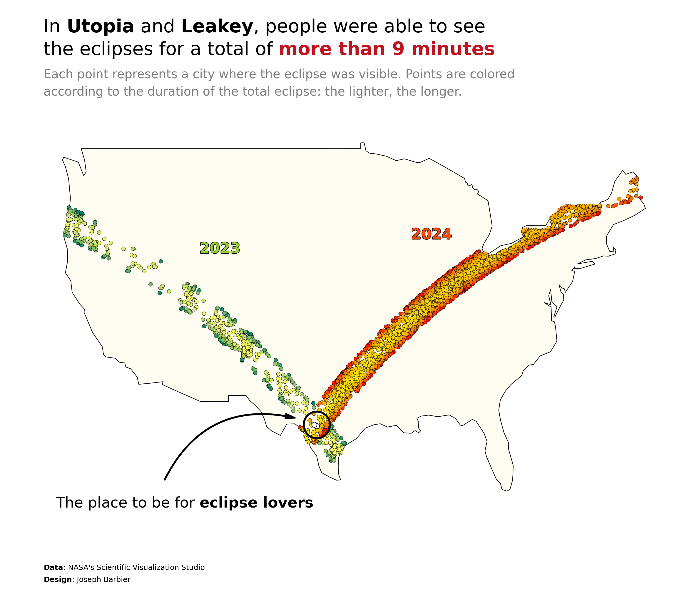
This plot is a bubble map. It shows the cities of the USA where you can saw solar eclipses, and the duration of the eclipse.
The chart was made by Joseph B.. Thanks to him for accepting sharing his work here!
Let's see what the final picture will look like:
Libraries
First, you need to install the following librairies:
- matplotlib is used for creating the chart and add customization features
- pandas and
geopandasare used to put the data into a dataframe and manipulate geographical data geopandas: for the geographical datahighlight_text: to add beautiful annotations to the chart
And that's it!
# plot
import matplotlib.pyplot as plt
from highlight_text import fig_text, ax_text

# data
import pandas as pd
import geopandas as gpd
Dataset
For this reproduction, we're going to retrieve the data directly from the gallery's Github repo. This means we just need to give the right url as an argument to pandas' read_csv() function to retrieve the data.
The dataset contains one row per city where the eclipe was visible (with latitude and longitude) and the time at which the eclipse was at its minimum and maximum.
url = "https://raw.githubusercontent.com/holtzy/the-python-graph-gallery/master/static/data/eclipse_annular_2023.csv"
df_2023 = pd.read_csv(url)

url = "https://raw.githubusercontent.com/holtzy/the-python-graph-gallery/master/static/data/eclipse_total_2024.csv"
df_2024 = pd.read_csv(url)
First we create a color column in the dataset:
from matplotlib.colors import Normalize
from matplotlib.cm import ScalarMappable

norm = Normalize(vmin=df_2023['duration'].min(), vmax=df_2023['duration'].max())
cmap2023 = plt.get_cmap('summer')
cmap2024 = plt.get_cmap('autumn')
sm2023 = ScalarMappable(norm=norm, cmap=cmap2023)
sm2024 = ScalarMappable(norm=norm, cmap=cmap2024)
df_2023['color'] = df_2023['duration'].apply(lambda x: sm2023.to_rgba(x))
df_2024['color'] = df_2024['duration'].apply(lambda x: sm2024.to_rgba(x))
For the end of this post, we also compute the duration of the eclipse in each city and sort the cities by duration to highlight the cities where the eclipse was the longest:
combined_df = pd.merge(
    df_2023[['name', 'duration', 'lat', 'lon']],
    df_2024[['name', 'duration', 'lat', 'lon']],
    on='name', suffixes=('_2023', '_2024')
)
combined_df['Total_duration'] = combined_df['duration_2023'] + combined_df['duration_2024']

# Find the top 10 names by total duration
combined_df.sort_values('Total_duration', ascending=False, inplace=True)
combined_df.head()| name | duration_2023 | lat_2023 | lon_2023 | duration_2024 | lat_2024 | lon_2024 | Total_duration | |
|---|---|---|---|---|---|---|---|---|
| 186 | Utopia | 4.850000 | 29.624088 | -99.512655 | 4.383333 | 29.624088 | -99.512655 | 9.233333 |
| 151 | Leakey | 4.750000 | 29.725358 | -99.763098 | 4.433333 | 29.725358 | -99.763098 | 9.183333 |
| 24 | Edgewood | 4.616667 | 35.131319 | -106.220161 | 4.266667 | 32.690760 | -95.882221 | 8.883333 |
| 164 | Midland | 4.766667 | 32.024642 | -102.113467 | 3.950000 | 39.118047 | -87.189998 | 8.716667 |
| 91 | Bandera | 4.583333 | 29.725126 | -99.074261 | 4.116667 | 29.725126 | -99.074261 | 8.700000 |
Get map positions
We need to find a way to get actual country shape to put in our plot. For this we need to load a mapping dataset that you can get at Natural Earth Data (Download countries button). Then unzip it and load it with the following code:
# world data (Replace with your path)
world = gpd.read_file(
    "../../static/data/ne_110m_admin_0_countries/ne_110m_admin_0_countries.shp"
)

# filter on USA
us = world[world['CONTINENT'] == 'North America']
usa = us[us['NAME'] == 'United States of America']
Once we get that file, we need to merge it with our actual dataset:
Background map
Thanks to the geopandas library, we can easily add a background map to our plot. We just need to call the plot() function on our geo dataframe.
With just a few lines of code, we can create a syntetic map that shows a US map.
fig, ax = plt.subplots(figsize=(8, 8))
usa.plot(ax=ax)

plt.tight_layout()
plt.show()
Custom the axis
When we create map, we are generally not interested in the axis because the map itself contains all the information. For this, we use the axis('off') function to remove the axis.
We start by customizing the x and y axis limits to focus on the area of interest: where the eclipses were visible. We use the xlim() and ylim() functions to do this.
fig, ax = plt.subplots(figsize=(8, 8))
usa.plot(ax=ax)

# custom axis
ax.set_xlim(-130, -65)
ax.set_ylim(20, 55)

# display the plot
plt.tight_layout()
plt.show()
Add scatter plots
Now that we have our map, we can add the scatter plots. We use the scatter() function to do this.
We can customize the size and color of the points to make them more visible.
fig, ax = plt.subplots(figsize=(8, 8))

# background map
usa.plot(ax=ax)

# plot eclipses
for i,df in enumerate([df_2023, df_2024]):
    ax.scatter(
        df['lon'],
        df['lat'],
        color='black',
        s=10
    )

# custom axis to focus on USA
ax.set_xlim(-130, -65)
ax.set_ylim(20, 55)
ax.axis('off')

# display the plot
plt.tight_layout()
plt.show()
Custom other colors
Colors is part of the most important part of a plot. Here we define lots of colors to make the plot more readable and beautiful.
Concretly, here is what we change:
- edgecolor of the map and individual data points
- background color of the plot
- color of the data points according to the duration of the eclipse
fig, ax = plt.subplots(figsize=(8, 8))

# background map
usa.plot(ax=ax, edgecolor='black', color='#fffcf2', linewidth=0.5)

# plot eclipses
colors = ['#e09f3e', '#9e2a2b']
for i,df in enumerate([df_2023, df_2024]):
    ax.scatter(
        df['lon'], df['lat'], # coordinates
        c=df['color'], edgecolor='black', # colors
        s=10, linewidth=0.2, # size and edge width
    )

# custom axis to focus on USA
ax.set_xlim(-130, -65)
ax.set_ylim(20, 55)
ax.axis('off')

# display the plot
plt.tight_layout()
plt.show()
It's already looking better
Annotations
Annotations is probably the most important part of nice visualizations! Unfortunately, it's also a part that takes a lot of time and code 😅.
Add a title
The title is added with the text() function and not the title() function because it gives us more customization options.
Add a credit
For the credit, we need the highlight_text package that makes way easier customizing annotations! We use the fig_text() function, which is similar to fig.text() but with more customization options.
Add arrows
We will create a custom arrow in Matplotlib by defining its style, size, and color, and then positions it on the figure using specified tail and head coordinates. It uses a FancyArrowPatch for flexible styling, including an arc connection style, and adds this arrow to the current plot's axes. This approach allows for detailed customization and highlighting within visual presentations, making it ideal for annotating or drawing attention to specific areas of a plot.
fig, ax = plt.subplots(figsize=(8, 8))

# background map
usa.plot(ax=ax, edgecolor='black', color='#fffcf2', linewidth=0.5)

# plot eclipses
colors = ['#e09f3e', '#9e2a2b']
for i,df in enumerate([df_2023, df_2024]):
    ax.scatter(
        df['lon'], df['lat'], # coordinates
        color=df['color'], edgecolor='black', # colors
        s=10, linewidth=0.2, # size and edge width
    )

# custom axis to focus on USA
ax.set_xlim(-130, -65)
ax.set_ylim(20, 55)
ax.axis('off')

# title
top_minutes = combined_df['Total_duration'].iloc[0]
top_city1 = combined_df['name'].iloc[0]
top_city2 = combined_df['name'].iloc[1]
text = f"""
In <{top_city1}> and <{top_city2}>, people were able to see
the eclipses for a total of <more than {top_minutes:.0f} minutes>

<Each point represents a city where the eclipse was visible. Points are colored>
<according to the duration of the total eclipse: the lighter, the longer.>
"""
fig_text(
    0.1, 0.85, text,
    ha='left', va='center',
    fontsize=15,
    color='black',
    highlight_textprops=[
        {"fontweight": 'bold'},
        {"fontweight": 'bold'},
        {"color": '#c1121f', "fontweight": 'bold'},
        {"color": "grey", "fontsize": 10},
        {"color": "grey", "fontsize": 10}
    ]
)

# highlight the top cities
years = ['2023', '2024']
for i in range(2):
    city = combined_df['name'].iloc[i]
    ax.scatter(
        combined_df['lon_'+years[i]].iloc[i],
        combined_df['lat_'+years[i]].iloc[i],
        color='white',
        edgecolor='black',
        linewidth=.5,
        s=18,
        zorder=10
    )

# circle around the top city
from matplotlib.patches import Ellipse
def add_ellipse(ax, xy, radius=1.3, color='black', lw=1.6, scale_ratio=1.1):
    ellipse = Ellipse(xy, width=radius*2, height=radius*1.3*scale_ratio, edgecolor=color, fill=False, lw=lw)
    ax.add_patch(ellipse)
add_ellipse(ax, (-99.5, 29.7))

# arrow
from matplotlib.patches import FancyArrowPatch
def draw_arrow(tail_position, head_position, invert=False):
    kw = dict(arrowstyle="Simple, tail_width=0.5, head_width=4, head_length=8", color="k")
    if invert:
        connectionstyle = "arc3,rad=-.4"
    else:
        connectionstyle = "arc3,rad=.4"
    a = FancyArrowPatch(
        tail_position, head_position,
        connectionstyle=connectionstyle,
        transform=fig.transFigure,
        **kw
    )
    fig.patches.append(a)
draw_arrow((0.27, 0.25), (0.46, 0.34), invert=True)

# annotations THE PLACE TO BE
text = "The place to be for <eclipse lovers>"
fig_text(
    0.3, 0.22,
    text,
    ha='center', va='center',
    fontsize=12,
    color='black',
    highlight_textprops=[
        {"fontweight": 'bold'}
    ]
)

# 2023 and 2024 annotations
import matplotlib.patheffects as path_effects
def path_effect_stroke(**kwargs):
    return [path_effects.Stroke(**kwargs), path_effects.Normal()]
pe = path_effect_stroke(linewidth=0.8, foreground="black")

text = "<2023>"
font_prop = {"color": 'yellowgreen', "path_effects": pe, "weight": 'bold'}
fig_text(
    0.35, 0.58,
    text,
    ha='center', va='center',
    fontsize=12,
    highlight_textprops=[font_prop]
)

text = "<2024>"
font_prop = {"color": 'orangered', "path_effects": pe, "weight": 'bold'}
fig_text(
    0.65, 0.6,
    text,
    ha='center', va='center',
    fontsize=12,
    highlight_textprops=[font_prop]
)

# credit
text = """
<Data>: NASA's Scientific Visualization Studio
<Design>: Joseph Barbier
"""
fig_text(
    0.1, 0.12,
    text,
    ha='left', va='center',
    fontsize=6,
    color='black',
    highlight_textprops=[
        {"fontweight": "bold"},
        {"fontweight": "bold"}
    ]
)

# display the plot
plt.tight_layout()
fig.savefig("../../static/graph/web-map-usa-with-scatter-plot-on-top.png", dpi=300, bbox_inches='tight')
plt.show()
Going further
This article explains how to reproduce a map with scatter plot with annotations, colormap and nice features.
For more examples of advanced customization in map, check out choropleth map of America. Also, you might be interested in creating interactive map with Folium.


