

About
This plot is a ridgeline. It is a way to display the distribution of a numerical variable for several groups.
It has been originally designed by Ansgar Wolsing in R. Here is a reproduction in Python by Joseph Barbier.
As a teaser, here is the plot we’re gonna try building:
Libraries
For creating this chart, we will need a whole bunch of libraries!
- matplotlib: to customize the appearance of the chart
- seaborn: to create the chart
- pandas: to handle the data
import matplotlib.pyplot as plt
import seaborn as sns
import pandas as pd
import numpy as np
Dataset
The data can be accessed using the url below.
The chart mainly relies on df, but rent and rent_words are used for annotation purposes.
rent_path = 'https://raw.githubusercontent.com/holtzy/The-Python-Graph-Gallery/master/static/data/rent.csv'
rent = pd.read_csv(rent_path)

rent_words_path = 'https://raw.githubusercontent.com/holtzy/The-Python-Graph-Gallery/master/static/data/rent_title_words.csv'
rent_words = pd.read_csv(rent_words_path)

df_path = 'https://raw.githubusercontent.com/holtzy/The-Python-Graph-Gallery/master/static/data/df_plot.csv'
df = pd.read_csv(df_path)
Simple ridgeline plot
Let's start by creating a (relatively) simple ridgeline plot.
Here are the main steps to create the chart:
- initiate a 15 rows and 1 column grid
- we create a list of the
words, sorted by the average price - we iterate over the list of words to create a subplot for each word with
kdeplot() - specify x and y axis limits to ensure each plot has the same scale
And that's it!
fig, axs = plt.subplots(nrows=15, ncols=1, figsize=(8, 10))
axs = axs.flatten() # needed to access each individual axis

# iterate over axes
words = df.sort_values('mean_price')['word'].unique().tolist()
for i, word in enumerate(words):

    # subset the data for each word
    subset = df[df['word'] == word]

    # plot the distribution of prices
    sns.kdeplot(
        subset['price'],
        shade=True,
        ax=axs[i]
    )

    # set title and labels
    axs[i].set_xlim(0, 10000)
    axs[i].set_ylim(0, 0.001)
    axs[i].set_ylabel('')

plt.show()
Change color and remove axis
First, we add a color and edgecolor argument to the kdeplot() function to change the color of the lines and the edge of the area.
Then, we remove each axis using set_axis_off().
fig, axs = plt.subplots(nrows=15, ncols=1, figsize=(8, 10))
axs = axs.flatten() # needed to access each individual axis

# iterate over axes
words = df.sort_values('mean_price')['word'].unique().tolist()
for i, word in enumerate(words):

    # subset the data for each word
    subset = df[df['word'] == word]

    # plot the distribution of prices
    sns.kdeplot(
        subset['price'],
        shade=True,
        ax=axs[i],
        color='grey',
        edgecolor='lightgrey'
    )

    # set title and labels
    axs[i].set_xlim(0, 10000)
    axs[i].set_ylim(0, 0.001)
    axs[i].set_ylabel('')

    # remove axis
    axs[i].set_axis_off()

plt.show()
Add median reference line and points
Now we add a median reference line to each plot using axvline() and a median point using scatter(), and this for each axis.
fig, axs = plt.subplots(nrows=15, ncols=1, figsize=(8, 10))
axs = axs.flatten() # needed to access each individual axis

# iterate over axes
words = df.sort_values('mean_price')['word'].unique().tolist()
for i, word in enumerate(words):

    # subset the data for each word
    subset = df[df['word'] == word]

    # plot the distribution of prices
    sns.kdeplot(
        subset['price'],
        shade=True,
        ax=axs[i],
        color='grey',
        edgecolor='lightgrey'
    )

    # mean value as a reference
    mean = subset['price'].mean()
    axs[i].scatter([mean], [0.0002], color='black', s=10)

    # global mean reference line
    global_mean = rent['price'].mean()
    axs[i].axvline(global_mean, color='#525252', linestyle='--')

    # set title and labels
    axs[i].set_xlim(0, 10000)
    axs[i].set_ylim(0, 0.001)
    axs[i].set_ylabel('')

    # remove axis
    axs[i].set_axis_off()

text = 'Median rent'
fig.text(
    0.35, 0.88,
    text,
    ha='center',
    fontsize=10
)

plt.show()
Quantile values on top
In order to add quantile values on top of the plot, we need to:
- calculate the quantile values for each word with
np.percentile() - define a list of colors that will be used to fill the space between them
- use the
fill_between()function with coordinates and colors to fill the space
darkgreen = '#9BC184'
midgreen = '#C2D6A4'
lightgreen = '#E7E5CB'
colors = [lightgreen, midgreen, darkgreen, midgreen, lightgreen]

fig, axs = plt.subplots(nrows=15, ncols=1, figsize=(8, 10))
axs = axs.flatten() # needed to access each individual axis

# iterate over axes
words = df.sort_values('mean_price')['word'].unique().tolist()
for i, word in enumerate(words):

    # subset the data for each word
    subset = df[df['word'] == word]

    # plot the distribution of prices
    sns.kdeplot(
        subset['price'],
        shade=True,
        ax=axs[i],
        color='grey',
        edgecolor='lightgrey'
    )

    # global mean reference line
    global_mean = rent['price'].mean()
    axs[i].axvline(global_mean, color='#525252', linestyle='--')

    # compute quantiles
    quantiles = np.percentile(subset['price'], [2.5, 10, 25, 75, 90, 97.5])
    quantiles = quantiles.tolist()

    # fill space between each pair of quantiles
    for j in range(len(quantiles) - 1):
        axs[i].fill_between(
            [quantiles[j], # lower bound
             quantiles[j+1]], # upper bound
            0, # max y=0
            0.0002, # max y=0.0002
            color=colors[j]
        )

    # mean value as a reference
    mean = subset['price'].mean()
    axs[i].scatter([mean], [0.0001], color='black', s=10)

    # set title and labels
    axs[i].set_xlim(0, 10000)
    axs[i].set_ylim(0, 0.001)
    axs[i].set_ylabel('')

    # remove axis
    axs[i].set_axis_off()

text = 'Median rent'
fig.text(
    0.35, 0.88,
    text,
    ha='center',
    fontsize=10
)

plt.show()
Annotations
Fonts
In the original chart, the author used a different font named Fira Sans. Here is how we load it with matplotlib:
- download the font from google font service
- install the font on your computer (on mac, double click on the downloaded file and click on "install font", then it will be available in the font book)
- get the path of the font (you can use the
fc-list | grep "Fira"command in your terminal to find it OR see the code below) - import the
FontPropertiesclass frommatplotlib.font_managerand use it to set the font of the annotation
And that's it! For this post we need 2 of them: FiraSans-Regular.ttf and FiraSans-SemiBold.ttf.
from matplotlib import font_manager

for fontpath in font_manager.findSystemFonts(fontpaths=None, fontext='ttf'):
    if 'firasans' in fontpath.lower():
        print(fontpath)
/Users/josephbarbier/Library/Fonts/FiraSans-Thin.ttf
/Users/josephbarbier/Library/Fonts/FiraSans-SemiBoldItalic.ttf
/Users/josephbarbier/Library/Fonts/FiraSans-BlackItalic.ttf
/Users/josephbarbier/Library/Fonts/FiraSans-Black.ttf
/Users/josephbarbier/Library/Fonts/FiraSans-ExtraBoldItalic.ttf
/Users/josephbarbier/Library/Fonts/FiraSans-ExtraLightItalic.ttf
/Users/josephbarbier/Library/Fonts/FiraSans-LightItalic.ttf
/Users/josephbarbier/Library/Fonts/FiraSans-SemiBold.ttf
/Users/josephbarbier/Library/Fonts/FiraSans-ThinItalic.ttf
/Users/josephbarbier/Library/Fonts/FiraSans-ExtraLight.ttf
/Users/josephbarbier/Library/Fonts/FiraSans-Regular.ttf
/Users/josephbarbier/Library/Fonts/FiraSans-Light.ttf
/Users/josephbarbier/Library/Fonts/FiraSans-Italic.ttf
/Users/josephbarbier/Library/Fonts/FiraSans-BoldItalic.ttf
/Users/josephbarbier/Library/Fonts/FiraSans-ExtraBold.ttf
/Users/josephbarbier/Library/Fonts/FiraSans-Medium.ttf
/Users/josephbarbier/Library/Fonts/FiraSans-Bold.ttf
/Users/josephbarbier/Library/Fonts/FiraSans-MediumItalic.ttf
from matplotlib.font_manager import FontProperties

personal_path = '/Users/josephbarbier/Library/Fonts/'

font_path = personal_path + 'FiraSans-Regular.ttf'
fira_sans_regular = FontProperties(fname=font_path)

font_path = personal_path + 'FiraSans-SemiBold.ttf'
fira_sans_semibold = FontProperties(fname=font_path)
Add annotations
Now that we have our font, we can add the annotations.
This mainly relies on the text() function from matplotlib. We just need to specify the x and y coordinates of the text, the text itself, and the font properties.
darkgreen = '#9BC184'
midgreen = '#C2D6A4'
lowgreen = '#E7E5CB'
colors = [lowgreen, midgreen, darkgreen, midgreen, lowgreen]
darkgrey = '#525252'
fig, axs = plt.subplots(nrows=15, ncols=1, figsize=(8, 10))
axs = axs.flatten() # needed to access each individual axis
# iterate over axes
words = df.sort_values('mean_price')['word'].unique().tolist()
for i, word in enumerate(words):
# subset the data for each word
subset = df[df['word'] == word]
# plot the distribution of prices
sns.kdeplot(
subset['price'],
shade=True,
ax=axs[i],
color='grey',
edgecolor='lightgrey'
)
# global mean reference line
global_mean = rent['price'].mean()
axs[i].axvline(global_mean, color=darkgrey, linestyle='--')
# display average number of bedrooms on left
rent_with_bed = rent_words[rent_words['beds'] > 0]
rent_with_bed_filter = rent_with_bed[rent_with_bed['word'] == word]
avg_bedrooms = rent_with_bed_filter['beds'].mean().round(1)
axs[i].text(
-600, 0,
f'({avg_bedrooms})',
ha='left',
fontsize=10,
fontproperties=fira_sans_regular,
color=darkgrey
)
# display word on left
axs[i].text(
-2000, 0,
word.upper(),
ha='left',
fontsize=10,
fontproperties=fira_sans_semibold,
color=darkgrey
)
# compute quantiles
quantiles = np.percentile(subset['price'], [2.5, 10, 25, 75, 90, 97.5])
quantiles = quantiles.tolist()
# fill space between each pair of quantiles
for j in range(len(quantiles) - 1):
axs[i].fill_between(
[quantiles[j], # lower bound
quantiles[j+1]], # upper bound
0, # max y=0
0.0002, # max y=0.0002
color=colors[j]
)
# mean value as a reference
mean = subset['price'].mean()
axs[i].scatter([mean], [0.0001], color='black', s=10)
# set title and labels
axs[i].set_xlim(0, 10000)
axs[i].set_ylim(0, 0.001)
axs[i].set_ylabel('')
# x axis scale for last ax
if i == 14:
values = [2500, 5000, 7500, 10000]
for value in values:
axs[i].text(
value, -0.0005,
f'{value}',
ha='center',
fontsize=10
)
# remove axis
axs[i].set_axis_off()
# reference line label
text = 'Median rent'
fig.text(
0.35, 0.88,
text,
ha='center',
fontsize=10
)
# number of bedrooms label
text = '(Ø bedrooms)'
fig.text(
0.04, 0.88,
text,
ha='left',
fontsize=10,
fontproperties=fira_sans_regular,
color=darkgrey
)
# credit
text = """
Axis capped at 10,000 USD.
Data: Pennington, Kate (2018).
Bay Area Craigslist Rental Housing Posts, 2000-2018.
Retrieved from github.com/katepennington/historic_bay_area_craigslist_housing_posts/blob/master/clean_2000_2018.csv.zip.
Visualization: Ansgar Wolsing
"""
fig.text(
-0.03, -0.05,
text,
ha='left',
fontsize=8,
fontproperties=fira_sans_regular
)
# x axis label
text = "Rent in USD"
fig.text(
0.5, 0.06,
text,
ha='center',
fontsize=14,
fontproperties=fira_sans_regular
)
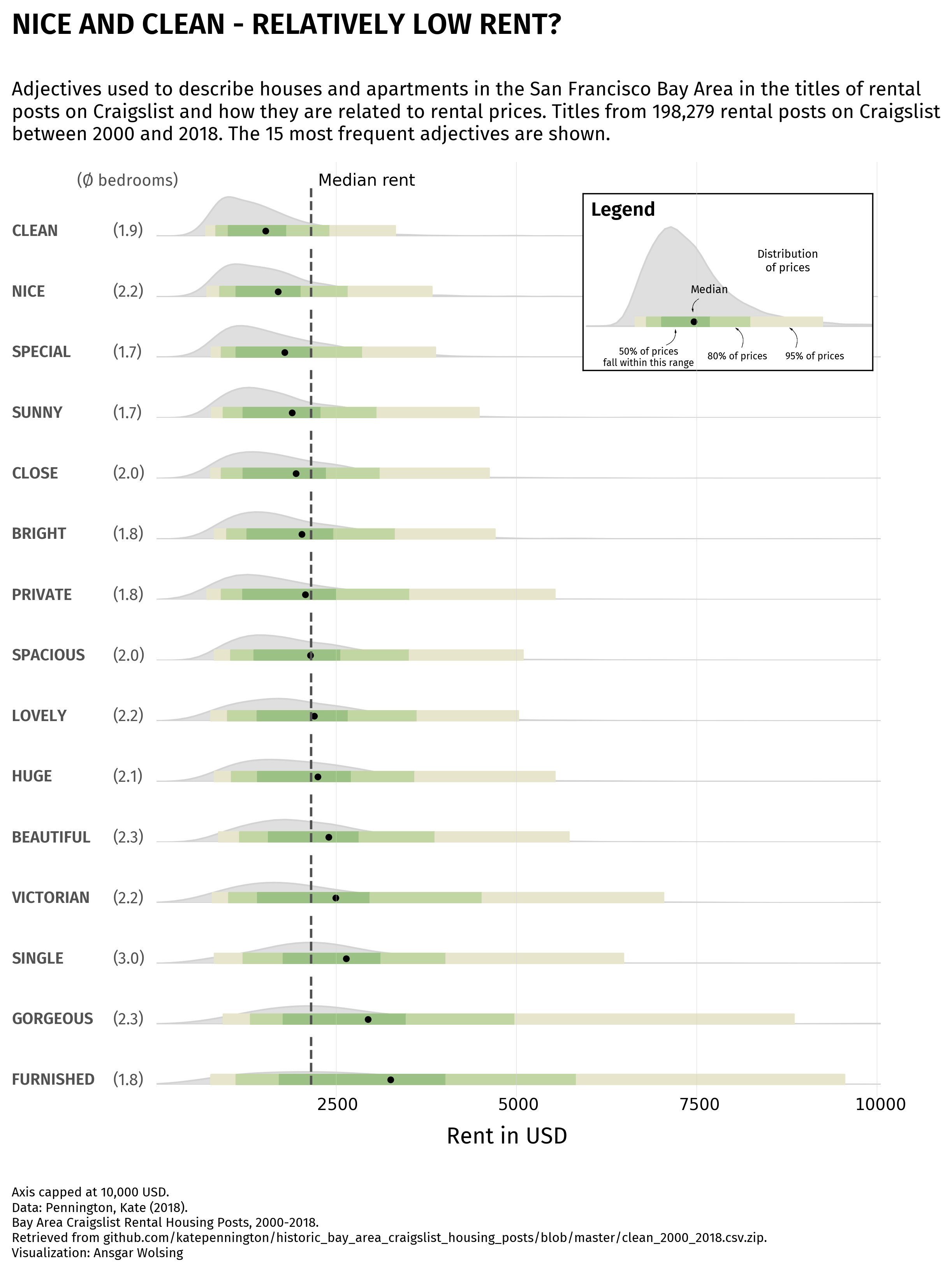
# description
text = """
Adjectives used to describe houses and apartments in the San Francisco Bay Area in the titles of rental
posts on Craigslist and how they are related to rental prices. Titles from 198,279 rental posts on Craigslist
between 2000 and 2018. The 15 most frequent adjectives are shown.
"""
fig.text(
-0.03, 0.9,
text,
ha='left',
fontsize=14,
fontproperties=fira_sans_regular
)
# title
text = "NICE AND CLEAN - RELATIVELY LOW RENT?"
fig.text(
-0.03, 1.01,
text,
ha='left',
fontsize=18,
fontproperties=fira_sans_semibold
)
plt.savefig('../../static/graph/web-ridgeline-by-text-1.png', dpi=300, bbox_inches='tight')
plt.show()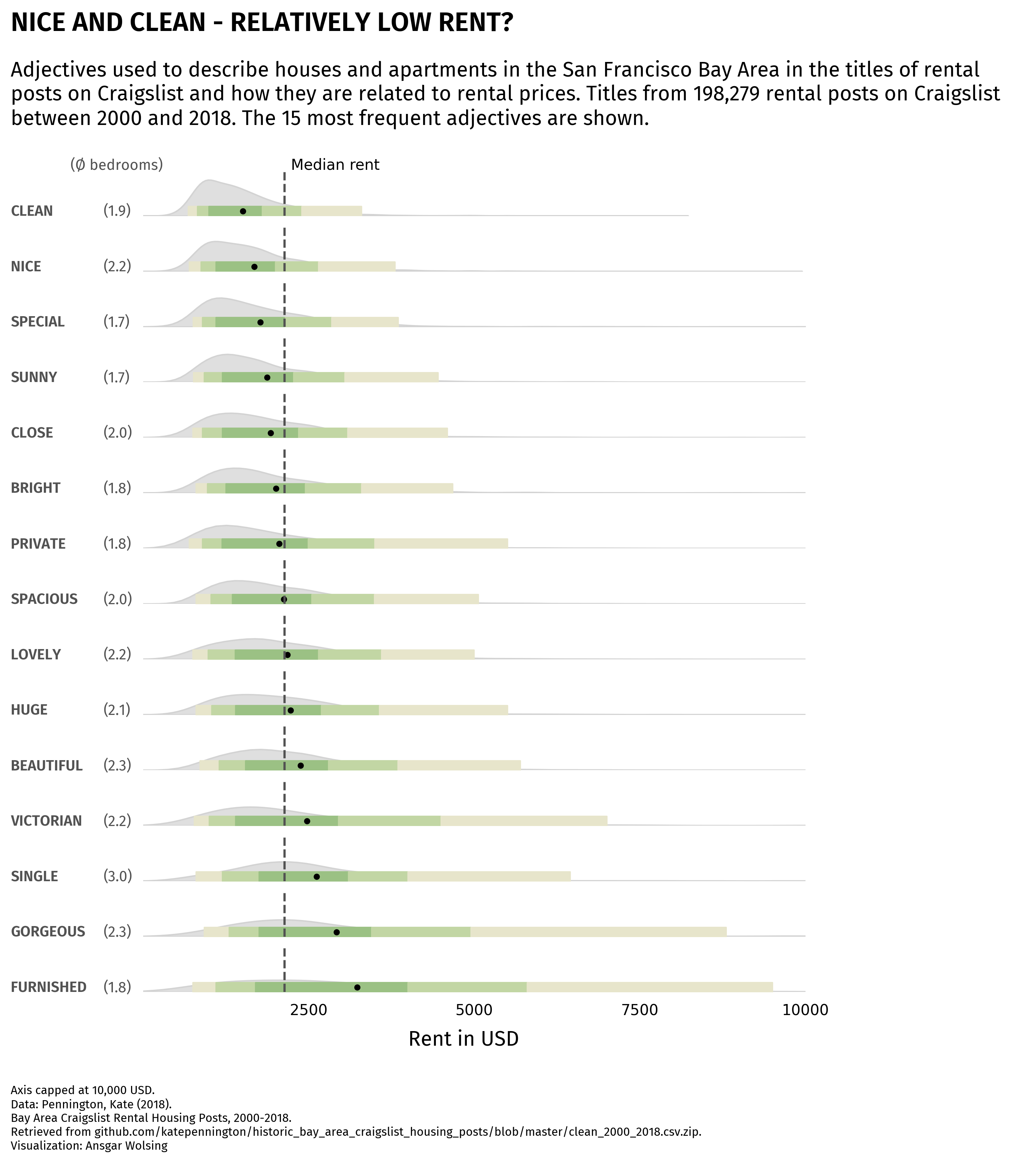
Legend
The legend is the part of the chart that will makes the result more understandable.
In this case, we use the inset_axes() function to create axes inside another one. This function needs:
- the position of the new axes (in this case, the top right corner)
- the width and height of the new axes
- the parent axes (in this case, the top one)
Then we just have to add the template chart inside this new axes, and a bunch of other annotations to make it look like a legend.
darkgreen = '#9BC184'
midgreen = '#C2D6A4'
lowgreen = '#E7E5CB'
colors = [lowgreen, midgreen, darkgreen, midgreen, lowgreen]

darkgrey = '#525252'

fig, axs = plt.subplots(nrows=15, ncols=1, figsize=(8, 10))
axs = axs.flatten() # needed to access each individual axis

# iterate over axes
words = df.sort_values('mean_price')['word'].unique().tolist()
for i, word in enumerate(words):

    # subset the data for each word
    subset = df[df['word'] == word]

    # plot the distribution of prices
    sns.kdeplot(
        subset['price'],
        shade=True,
        ax=axs[i],
        color='grey',
        edgecolor='lightgrey'
    )

    # global mean reference line
    global_mean = rent['price'].mean()
    axs[i].axvline(global_mean, color=darkgrey, linestyle='--')

    # display average number of bedrooms on left
    rent_with_bed = rent_words[rent_words['beds'] > 0]
    rent_with_bed_filter = rent_with_bed[rent_with_bed['word'] == word]
    avg_bedrooms = rent_with_bed_filter['beds'].mean().round(1)
    axs[i].text(
        -600, 0,
        f'({avg_bedrooms})',
        ha='left',
        fontsize=10,
        fontproperties=fira_sans_regular,
        color=darkgrey
    )

    # display word on left
    axs[i].text(
        -2000, 0,
        word.upper(),
        ha='left',
        fontsize=10,
        fontproperties=fira_sans_semibold,
        color=darkgrey
    )

    # compute quantiles
    quantiles = np.percentile(subset['price'], [2.5, 10, 25, 75, 90, 97.5])
    quantiles = quantiles.tolist()

    # fill space between each pair of quantiles
    for j in range(len(quantiles) - 1):
        axs[i].fill_between(
            [quantiles[j], # lower bound
             quantiles[j+1]], # upper bound
            0, # max y=0
            0.0002, # max y=0.0002
            color=colors[j]
        )

    # mean value as a reference
    mean = subset['price'].mean()
    axs[i].scatter([mean], [0.0001], color='black', s=10)

    # set title and labels
    axs[i].set_xlim(0, 10000)
    axs[i].set_ylim(0, 0.001)
    axs[i].set_ylabel('')

    # x axis scale for last ax
    if i == 14:
        values = [2500, 5000, 7500, 10000]
        for value in values:
            axs[i].text(
                value, -0.0005,
                f'{value}',
                ha='center',
                fontsize=10
            )

    # remove axis
    axs[i].set_axis_off()

text = 'Median rent'
fig.text(
    0.35, 0.88,
    text,
    ha='center',
    fontsize=10
)

# credit
text = """
Axis capped at 10,000 USD.
Data: Pennington, Kate (2018).
Bay Area Craigslist Rental Housing Posts, 2000-2018.
Retrieved from github.com/katepennington/historic_bay_area_craigslist_housing_posts/blob/master/clean_2000_2018.csv.zip.
Visualization: Ansgar Wolsing
"""
fig.text(
    -0.03, -0.05,
    text,
    ha='left',
    fontsize=8,
    fontproperties=fira_sans_regular
)

# x axis label
text = "Rent in USD"
fig.text(
    0.5, 0.06,
    text,
    ha='center',
    fontsize=14,
    fontproperties=fira_sans_regular
)

# description
text = """
Adjectives used to describe houses and apartments in the San Francisco Bay Area in the titles of rental
posts on Craigslist and how they are related to rental prices. Titles from 198,279 rental posts on Craigslist
between 2000 and 2018. The 15 most frequent adjectives are shown.
"""
fig.text(
    -0.03, 0.9,
    text,
    ha='left',
    fontsize=12,
    fontproperties=fira_sans_regular
)

# title
text = "NICE AND CLEAN - RELATIVELY LOW RENT?"
fig.text(
    -0.03, 1.01,
    text,
    ha='left',
    fontsize=18,
    fontproperties=fira_sans_semibold
)

# number of bedrooms label
text = '(Ø bedrooms)'
fig.text(
    0.04, 0.88,
    text,
    ha='left',
    fontsize=10,
    fontproperties=fira_sans_regular,
    color=darkgrey
)

# legend on the first ax
from mpl_toolkits.axes_grid1.inset_locator import inset_axes
subax = inset_axes(
    parent_axes=axs[0],
    width="40%",
    height="350%",
    loc=1
)
subax.set_xticks([])
subax.set_yticks([])
beautiful_subset = df[df['word'] == 'beautiful']
sns.kdeplot(
    beautiful_subset['price'],
    shade=True,
    ax=subax,
    color='grey',
    edgecolor='lightgrey'
)
quantiles = np.percentile(beautiful_subset['price'], [2.5, 10, 25, 75, 90, 97.5])
quantiles = quantiles.tolist()
for j in range(len(quantiles) - 1):
    subax.fill_between(
        [quantiles[j], # lower bound
         quantiles[j+1]], # upper bound
        0, # max y=0
        0.00004, # max y=0.00004
        color=colors[j]
    )
subax.set_xlim(-500, 7000)
subax.set_ylim(-0.0002, 0.0006)
mean = beautiful_subset['price'].mean()
subax.scatter([mean], [0.00002], color='black', s=10)
subax.text(
    -300, 0.0005,
    'Legend',
    ha='left',
    fontsize=12,
    fontproperties=fira_sans_semibold
)
subax.text(
    4800, 0.00025,
    'Distribution\nof prices',
    ha='center',
    fontsize=7,
    fontproperties=fira_sans_regular
)
subax.text(
    mean+400, 0.00015,
    'Median',
    ha='center',
    fontsize=7,
    fontproperties=fira_sans_regular
)
subax.text(
    5500, -0.00015,
    "95% of prices",
    ha='center',
    fontsize=6,
    fontproperties=fira_sans_regular
)
subax.text(
    3500, -0.00015,
    "80% of prices",
    ha='center',
    fontsize=6,
    fontproperties=fira_sans_regular
)
subax.text(
    1200, -0.00018,
    "50% of prices\nfall within this range",
    ha='center',
    fontsize=6,
    fontproperties=fira_sans_regular
)

# arrows in the legend
import matplotlib.patches as patches
def add_arrow(head_pos, tail_pos, ax):
    style = "Simple, tail_width=0.01, head_width=1, head_length=2"
    kw = dict(arrowstyle=style, color="k", linewidth=0.2)
    arrow = patches.FancyArrowPatch(
        tail_pos, head_pos,
        connectionstyle="arc3,rad=.5",
        **kw
    )
    ax.add_patch(arrow)
add_arrow((mean, 0.00005), (mean+200, 0.00013), subax) # median
add_arrow((mean+1000, 0), (mean+1200, -0.00011), subax) # 80%
add_arrow((mean+2400, 0), (mean+2600, -0.00011), subax) # 95%
add_arrow((mean-500, 0), (mean-800, -0.00009), subax) # 50%

# background grey lines
from matplotlib.lines import Line2D
def add_line(xpos, ypos, fig=fig):
    line = Line2D(
        xpos, ypos,
        color='lightgrey',
        lw=0.2,
        transform=fig.transFigure
    )
    fig.lines.append(line)
add_line([0.317, 0.317], [0.1, 0.9])
add_line([0.51, 0.51], [0.1, 0.9])
add_line([0.703, 0.703], [0.1, 0.9])
add_line([0.896, 0.896], [0.1, 0.9])

plt.savefig('../../static/graph/web-ridgeline-by-text.png', dpi=300, bbox_inches='tight')
plt.show()
Going further
This post explains how to create a ridgeline plot with matplotlib and seaborn. You can check the dedicated section of the gallery for more examples.
You might also be interested in combining density plot and boxplot in raincloud plot or how to have axes with different scales.


