
Libraries & Dataset
First, we need to load a few libraries:
- seaborn for the heatmap
- matplotlib for chart customization
- pandas for data manipulation
numpyfor data generation
# libraries
import seaborn as sns
import matplotlib.pyplot as plt
import pandas as pd
import numpy as np

df = pd.DataFrame(
    np.random.random((10,10)),
    columns=["a","b","c","d","e","f","g","h","i","j"]
)Annotate each cell with value
The heatmap can show the exact value behind the color. To add a label to each cell, annot parameter of the heatmap() function should be set to True.
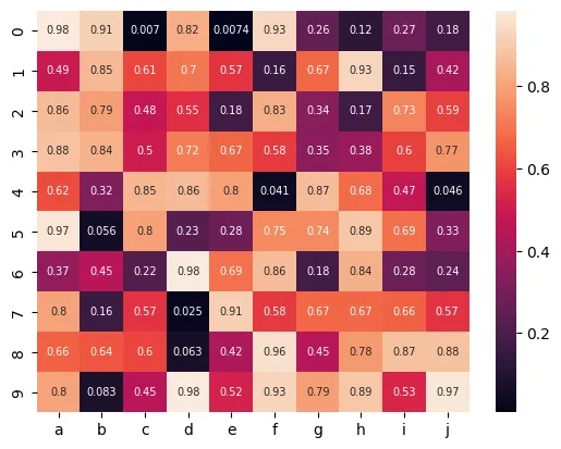
# plot a heatmap with annotation
sns.heatmap(df, annot=True, annot_kws={"size": 7})
plt.show()Custom grid lines
The following parameters will make customizations to the heatmap plot:
linewidth: the thickness of the lineslinecolor: the color of the lines
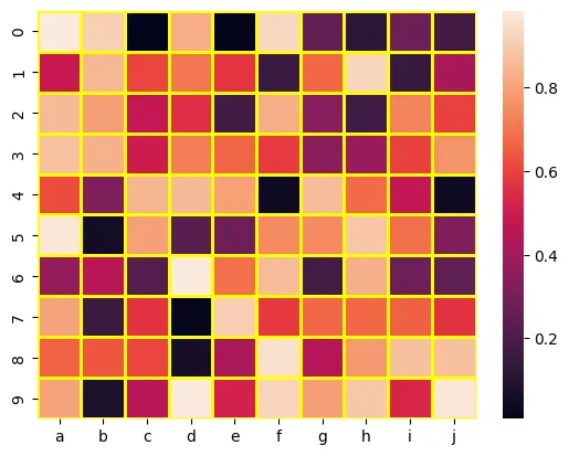
# plot a heatmap with custom grid lines
sns.heatmap(df, linewidths=2, linecolor='yellow')
plt.show()Remove X or Y labels
yticklabels and xticklabels control the presence / abscence of labels for the Y and X axis respectively.
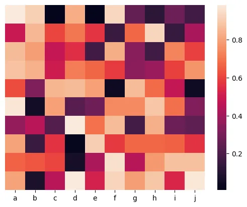
# plot a heatmap
sns.heatmap(df, yticklabels=False)
plt.show()Remove color bar
You can remove the color bar from a heatmap plot by giving False to the parameter cbar.
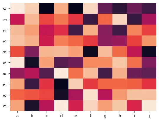
# plot a heatmap
sns.heatmap(df, cbar=False)
plt.show()Hide a few axis labels to avoid overlapping
As you can remove x or y labels by setting xticklabels or yticklabels as False, you can also give an integer to plot only every n label.
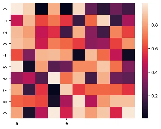
# plot a heatmap
sns.heatmap(df, xticklabels=4)
plt.show()Going further
This post explains how to create a heatmap with matplotlib and seaborn.
You might be interested by:
- how to create from different data format input
- how to control colors in heatmap
- use heatmap with clustering and dendograms


