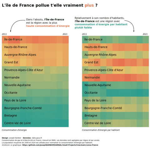
Heatmap

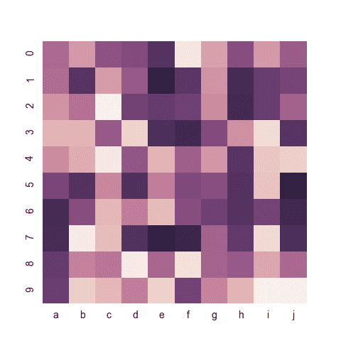
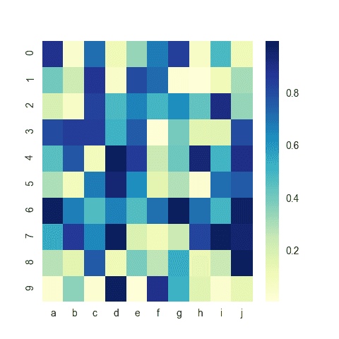
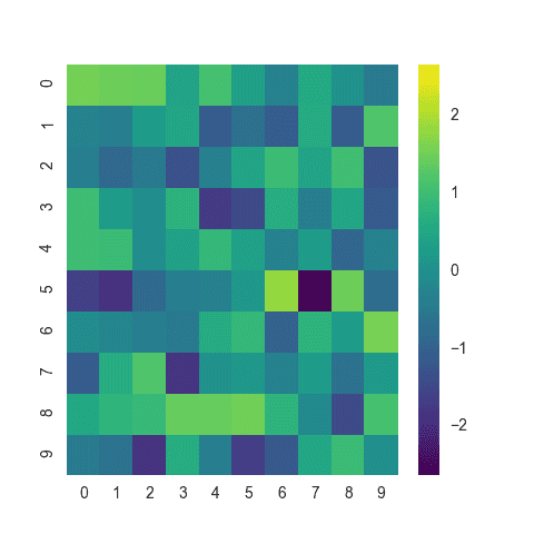
A heatmap is a graphical representation of data where each value of a matrix is represented as a color. This page explains how to build a heatmap with Python, with an emphasis on the Seaborn library.
⏱ Quick start
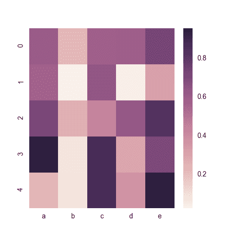
If you're in a rush and want to make a heatmap with Python as quick as possible, have a look to this code snippet that uses the heatmap() function of Seaborn.🔥
# library
import seaborn as sns
import pandas as pd
import numpy as np

# Create a dataset
df = pd.DataFrame(np.random.random((5,5)), columns=["a","b","c","d","e"])

# Default heatmap
p1 = sns.heatmap(df)
 Heatmap with
 Seaborn
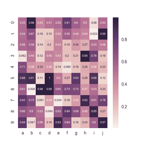
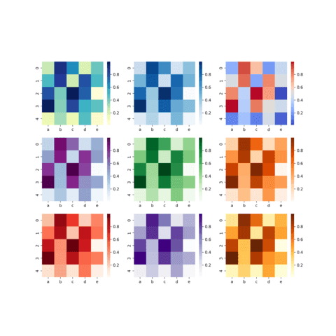
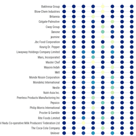
Seaborn is a python library allowing to make better charts easily thanks to its heatmap() function. This section starts with a post describing the basic usage of the function based on any kind of data input. Next it will guide you through the different ways to customize the chart, like controling color and data normalization.
⚠️ Python heatmap and normalization
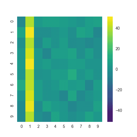
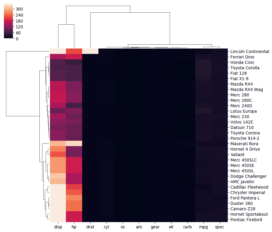
Consider the left heatmap below. The second column from the left (variable 1) has very high values compared to others. As a result, the variation existing in other variables is hidden.
Highlighting the variable 1 can be the main message of your chart. But if you're interested in other variable variations as well, you probably want to apply some normalization as shown on the right heatmap.
If you want to know more about normalization, check data-to-viz.com. If you want some python code to do it, it's here.
❄ Python, Heatmap and Clustering
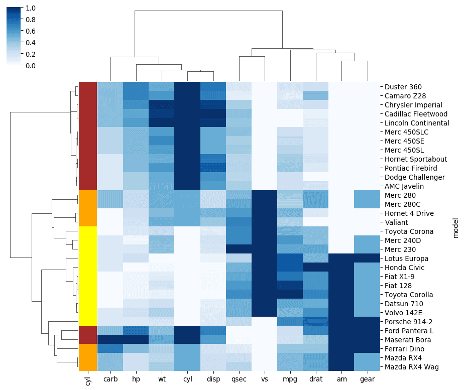
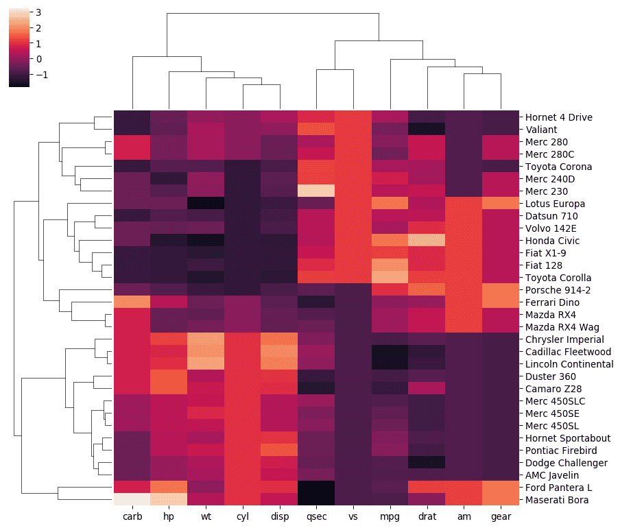
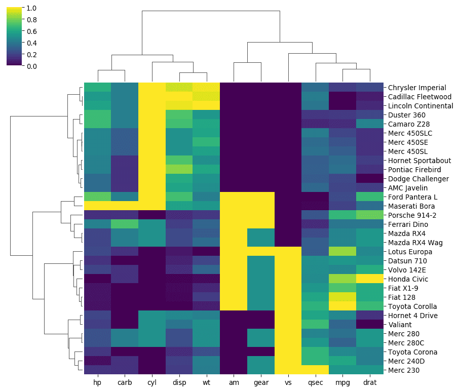
It is very common to apply some clustering techniques on a heatmap. The idea is to group items that have the same kind of pattern for their numeric variables. 💡
Usually, it is recommended to display a dendrogram on top of the heatmap to explain how the clusterization has been performed. Last but not least, it can be useful to compare the grouping we got with an expected structure, shown as an additional color.
Heatmap for timeseries
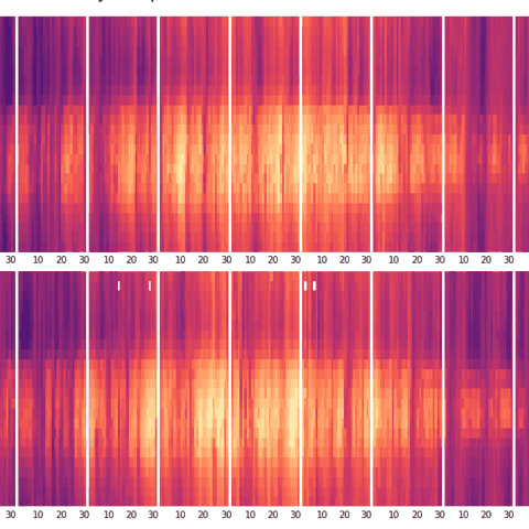
A heatmap can be used to display some temporal data. Here is an example using matplotlib where the evolution of a temperature is displayed over the hour of the day (Y axis) and the day of the year (X axis) organized by month.
Calendar Heatmap
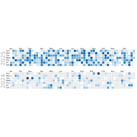
A calendar heatmap is a great way to use heatmap to represent the evolution of a variable measured daily. It's quite straightforward to build thanks to the dayplot library.
 Best python heatmap examples
The web is full of astonishing charts made by awesome bloggers, (often using R). The Python graph gallery tries to display (or translate from R) some of the best creations and explain how their source code works. If you want to display your work here, please drop me a word or even better, submit a Pull Request!
🚨 Grab the Data To Viz poster!
Do you know all the chart types? Do you know which one you should pick? I made a decision tree that answers those questions. You can download it for free!

