

About
Heatmap is a graphical representation of data where the individual values contained in a matrix are represented as colors. This is very useful to display the concentration of values between two dimensions, without looking at the individual values.
This chart has been created by Joseph Barbier. Thanks to him for accepting sharing its work here!
Libraries
First, we need to install the following libraries:
- matplotlib: for plot customization
- seaborn: for creating the plot
- pandas: for data manipulation
- highlight_text: for annotations
import matplotlib.pyplot as plt
from matplotlib.patches import FancyArrowPatch
import matplotlib.colors as mcolors
import seaborn as sns
import pandas as pd
from highlight_text import ax_text
Dataset
The type of data needed when creating a heatmap is a matrix. Each individual cell in the matrix represents a value that will be visualized using a color scale.
In this post we need 2 datasets:
- original heatmap
- normalized heatmap
path = 'https://raw.githubusercontent.com/holtzy/The-Python-Graph-Gallery/master/static/data/heatmap_data.csv'
heatmap_data = pd.read_csv(path, index_col=0)

path = 'https://raw.githubusercontent.com/holtzy/The-Python-Graph-Gallery/master/static/data/heatmap_data_norm.csv'
heatmap_data_norm = pd.read_csv(path, index_col=0)
Simple double heatmap
We start by creating a figure with 2 subplots.
The first subplot will contain the original heatmap, and the second subplot will contain the normalized heatmap.
We use the heatmap() function from seaborn to create the heatmaps.
fig, axs = plt.subplots(ncols=2, figsize=(16, 10))

# iterate over the datasets
for i, data in enumerate([heatmap_data, heatmap_data_norm]):

    # plot the heatmap
    sns.heatmap(
        data,
        ax=axs[i],
        cbar=False
    )

# save and show
plt.savefig('../../static/graph/web-heatmap-comparison-1.png', bbox_inches='tight')
plt.show()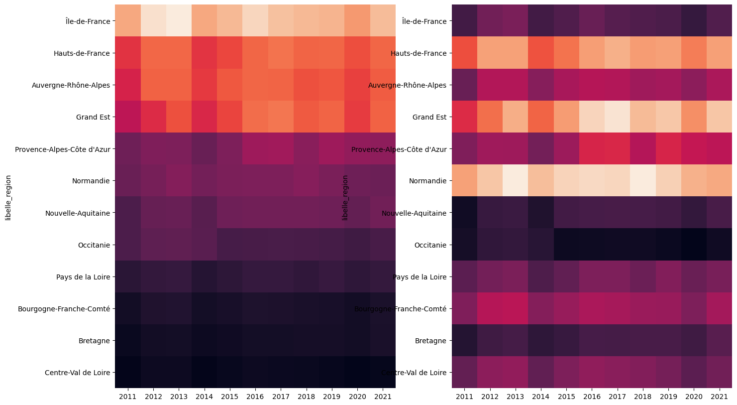
Custom color map and remove axis
The next step is to customize the color map and remove the axis.
- the colormap is created using the
LinearSegmentedColormap.from_list()function, and then we pass it as an argument to thecmapparameter of theheatmap()function - the axis is removed using the
set_axis_off()function
# create a custom colormap
cmap = mcolors.LinearSegmentedColormap.from_list("", ["#2a9d8f", "#e9c46a", "#e76f51"])

fig, axs = plt.subplots(ncols=2, figsize=(16, 10))

# iterate over the datasets
for i, data in enumerate([heatmap_data, heatmap_data_norm]):

    # plot the heatmap
    sns.heatmap(
        data,
        ax=axs[i],
        cmap=cmap,
        cbar=False
    )

    # remove the axis
    axs[i].set_axis_off()

# save and show
plt.savefig('../../static/graph/web-heatmap-comparison-2.png', bbox_inches='tight')
plt.show()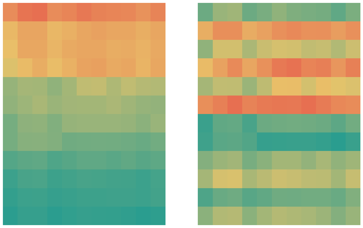
Add region labels
The next step is to add region labels to the heatmaps.
For this, we iterate over the index of the dataset (where the region names are stored) and add the text to the plot using the text() function. We have to specify:
- the x and y coordinates
- the text to display
- the horizontal alignment
- the vertical alignment
- the font size
- the font weight
Warning: make sure both of the heatmaps have the same region names in the same order, otherwise the labels will not match the regions.
# create a custom colormap
cmap = mcolors.LinearSegmentedColormap.from_list("", ["#2a9d8f", "#e9c46a", "#e76f51"])

fig, axs = plt.subplots(ncols=2, figsize=(16, 10))

# iterate over the datasets
for i, data in enumerate([heatmap_data, heatmap_data_norm]):

    # plot the heatmap
    sns.heatmap(
        data,
        ax=axs[i],
        cmap=cmap,
        cbar=False
    )

    # remove the axis
    axs[i].set_axis_off()

    # add the region names
    for j,region in enumerate(data.index):
        axs[i].text(
            0.4, # x axis position
            j+0.5, # y axis position
            f"{region}", # text
            ha='left',
            va='center',
            fontsize=17,
            fontweight='light',
        )

# save and show
plt.savefig('../../static/graph/web-heatmap-comparison-3.png', bbox_inches='tight')
plt.show()
Add legend
Now let's add a legend to the heatmaps so that it's more understandable.
We add both Consommation d'énergie and Consommation d'énergie par habitant to the legend using the text() function.
# create a custom colormap
cmap = mcolors.LinearSegmentedColormap.from_list("", ["#2a9d8f", "#e9c46a", "#e76f51"])

fig, axs = plt.subplots(ncols=2, figsize=(16, 10))

# iterate over the datasets
for i, data in enumerate([heatmap_data, heatmap_data_norm]):

    # plot the heatmap
    sns.heatmap(
        data,
        ax=axs[i],
        cmap=cmap,
        cbar=False
    )

    # remove the axis
    axs[i].set_axis_off()

    # add the region names
    for j,region in enumerate(data.index):
        axs[i].text(
            0.4, # x axis position
            j+0.5, # y axis position
            f"{region}", # text
            ha='left',
            va='center',
            fontsize=17,
            fontweight='light',
        )

    # description of each heatmap
    if i==0: # first heatmap
        text = "Consommation d'énergie"
    else: # second heatmap
        text = "Consommation d'énergie par habitant"
    ax_text(
        0, 12.4,
        f"<{text}>",
        ha='left', va='center',
        fontsize=12, fontweight='light',
        color='black',
        highlight_textprops=[
            {"style": "italic"}
        ],
        ax=axs[i]
    )

    # date for reference
    ax_text(
        0, -0.2,
        "<2011>",
        ha='left', va='center',
        fontsize=12, fontweight='light',
        color='black',
        highlight_textprops=[
            {"style": "italic"}
        ],
        ax=axs[i]
    )
    ax_text(
        10, -0.2,
        "<2021>",
        ha='left', va='center',
        fontsize=12, fontweight='light',
        color='black',
        highlight_textprops=[
            {"style": "italic"}
        ],
        ax=axs[i]
    )

# save and show
plt.savefig('../../static/graph/web-heatmap-comparison-4.png', bbox_inches='tight')
plt.show()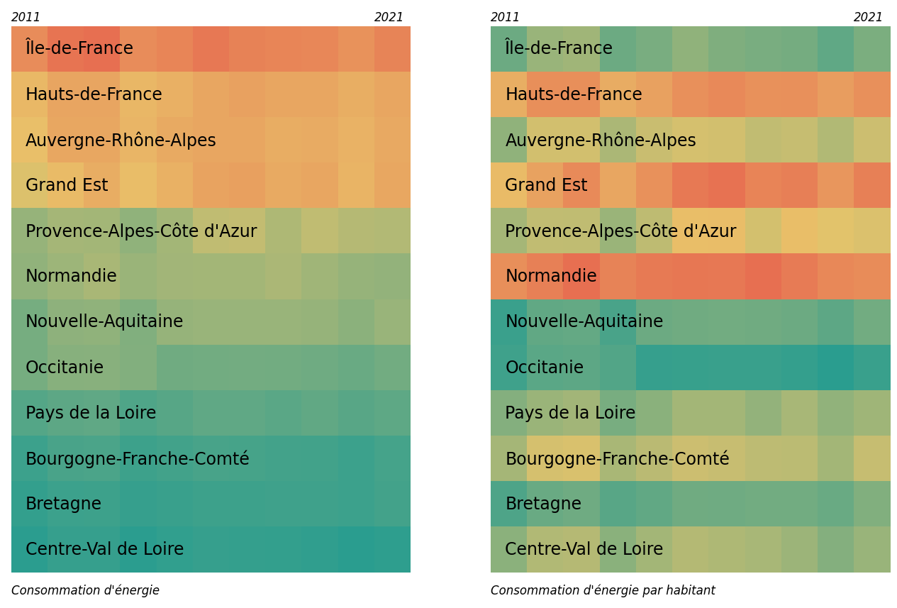
We have the main components of the plot! It only misses a title and a bunch of annotations.
# create a custom colormap
cmap = mcolors.LinearSegmentedColormap.from_list("", ["#2a9d8f", "#e9c46a", "#e76f51"])

fig, axs = plt.subplots(ncols=2, figsize=(16, 10))

# iterate over the datasets
for i, data in enumerate([heatmap_data, heatmap_data_norm]):

    # plot the heatmap
    sns.heatmap(
        data,
        ax=axs[i],
        cmap=cmap,
        cbar=False
    )

    # remove the axis
    axs[i].set_axis_off()

    # add the region names
    for j,region in enumerate(data.index):
        axs[i].text(
            0.4, # x axis position
            j+0.5, # y axis position
            f"{region}", # text
            ha='left',
            va='center',
            fontsize=17,
            fontweight='light',
        )

    # description of each heatmap
    if i==0: # first heatmap
        text = "Consommation d'énergie"
    else: # second heatmap
        text = "Consommation d'énergie par habitant"
    ax_text(
        0, 12.4,
        f"<{text}>",
        ha='left', va='center',
        fontsize=12, fontweight='light',
        color='black',
        highlight_textprops=[
            {"style": "italic"}
        ],
        ax=axs[i]
    )

    # date for reference
    ax_text(
        0, -0.2,
        "<2011>",
        ha='left', va='center',
        fontsize=12, fontweight='light',
        color='black',
        highlight_textprops=[
            {"style": "italic"}
        ],
        ax=axs[i]
    )
    ax_text(
        10, -0.2,
        "<2021>",
        ha='left', va='center',
        fontsize=12, fontweight='light',
        color='black',
        highlight_textprops=[
            {"style": "italic"}
        ],
        ax=axs[i]
    )

# title
text = "L'île de France pollue t'elle vraiment <plus> ?"
ax_text(
    0, -4,
    text,
    ha='left', va='center',
    fontsize=24, fontweight='bold',
    color='black',
    highlight_textprops=[
        {"color": "#e76f51"}
    ],
    ax=axs[0]
)

# subtitle
text = "Consommation d'énergie et consommation d'énergie par habitant, de 2011 à 2021, par région (or Corse et territoires d'outre-mer)"
ax_text(
    0, -3.5,
    text,
    ha='left', va='center',
    fontsize=14,
    color='grey',
    ax=axs[0]
)

# credit source
text = """
<Design>: Joseph Barbier   <Données>: data.gouv.fr
Consommation de gaz et d'électricité en France, mesuré en MWh. Les données sont agrégées par région et par année.
La population moyenne de 2008 et 2024 est utilisée pour normaliser la consommation d'énergie par habitant.
Améliorer ce graphique: <https://github.com/JosephBARBIERDARNAL/Small-Projects/tree/main/conso-france>
"""
ax_text(
    0, 13.9,
    text,
    ha='left', va='center',
    fontsize=10, fontweight='light',
    color='black',
    highlight_textprops=[
        {"fontweight": "bold"},
        {"fontweight": "bold"},
        {"fontweight": "bold"}
    ],
    ax=axs[0]
)

# left explanation
text = "Dans l'absolu, <l'Île-de-France>\nest la région avec la plus\n<haute consommation d'énergie>"
ax_text(
    4, -1.7,
    text,
    ha='left', va='center',
    fontsize=15, fontweight='light',
    color='black',
    highlight_textprops=[
        {"fontweight": "bold"},
        {"color": "#e76f51", "fontweight": "bold"}
    ],
    ax=axs[0]
)

# right explanation
text = "Relativement à son nombre d'habitants,\n<l'Île-de-France> est une région avec\n<consommation d'énergie par habitant>\n<plutôt faible>"
ax_text(
    12, -1.7,
    text,
    ha='left', va='center',
    fontsize=15, fontweight='light',
    color='black',
    highlight_textprops=[
        {"fontweight": "bold"},
        {"color": "#2a9d8f", "fontweight": "bold"},
        {"color": "#2a9d8f", "fontweight": "bold"}
    ],
    ax=axs[0]
)

# arrows
def draw_arrow(tail_position, head_position, invert=False):
    kw = dict(arrowstyle="Simple, tail_width=0.5, head_width=4, head_length=8", color="k")
    if invert:
        connectionstyle = "arc3,rad=-.5"
    else:
        connectionstyle = "arc3,rad=.5"
    a = FancyArrowPatch(tail_position, head_position,
                                connectionstyle=connectionstyle,
                                transform=fig.transFigure,
                                **kw)
    fig.patches.append(a)

draw_arrow((0.25, 1.01), (0.17, 0.91))
draw_arrow((0.77, 1.01), (0.82, 0.91), invert=True)

# save and show
plt.savefig('../../static/graph/web-heatmap-comparison-5.png', bbox_inches='tight')
plt.show()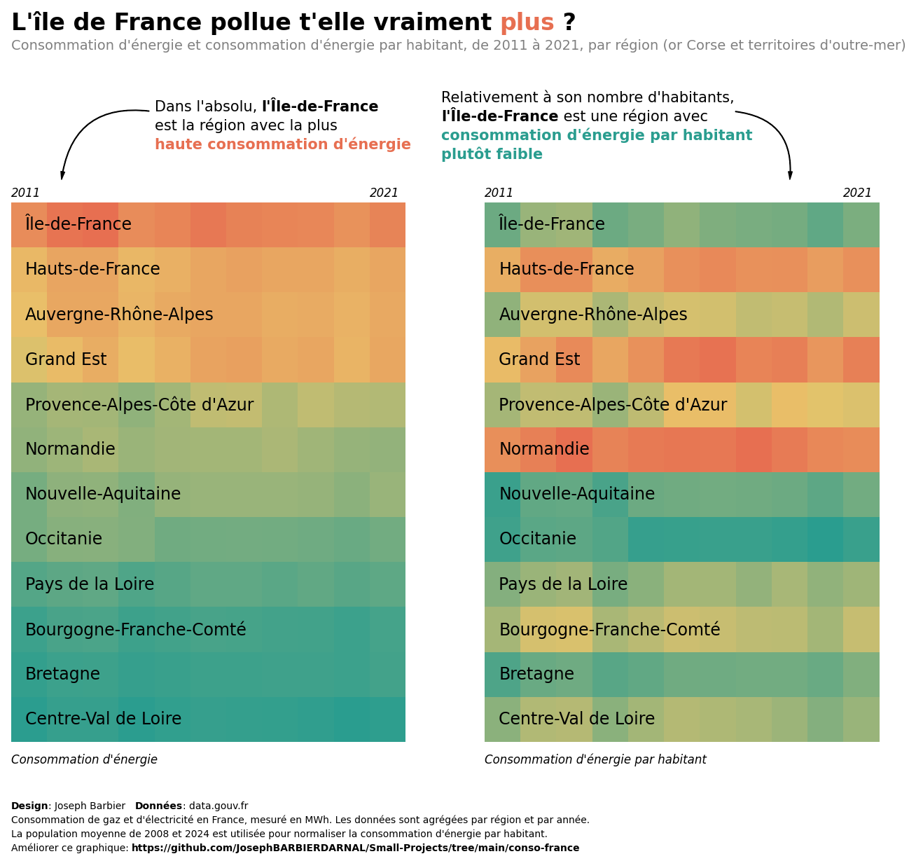
Going further
This post shows how to create a double heatmap with annotations using matplotlib and seaborn.
For more examples of advanced customization, check out how to create a beautiful legend and this really nice heatmap for time series.


