

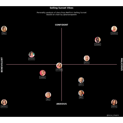
The chart to reproduce
Here is the chart we're trying to reproduce:
Libraries
The core of the chart is the manipulation of the images. For this, we'll need different libraries that allow us to open and display images on our visualization. The remainder of the graph (create the figure and add the annotations) is created with matplotlib.
PILis a powerful library for opening, manipulating, and saving various image file formatsnumpyis used to convert images to arrayspandasis used to open the dataset with the positionsmatplotlibis used to create and customize the chart
# Libraries
from PIL import Image
import numpy as np
import pandas as pd
import matplotlib.pyplot as plt
Dataset
The particularity of the dataset here is that the points will be the positions of the images on the graph. The data here has been created manually and put into a dataset to make the code easier to read. Finally, the dataset is opened using pandas' read_csv() function.
url = 'https://raw.githubusercontent.com/holtzy/The-Python-Graph-Gallery/master/static/data/selling_sunset.csv'
df = pd.read_csv(url)
Open images
For this reproduction, we need to open a large number of images and make a few modifications in order to use them. To do this, we create a function that takes a path (of the photo) as an argument and returns the usable image.
To retrieve the data, you can download them from the github repository of the gallery.
Note that the gallery has a dedicated tutorial on how to deal with images in a matplotlib chart.
# Open an image from a computer
def open_image(image_name, path):

    path_to_image = path + image_name # Combine path and image name
    image = Image.open(path_to_image) # Open the image
    image_array = np.array(image) # Convert to a numpy array

    return image_array # Output
Now we can use this function to store the images in a dictionnary where the keys are the names and the values are the images.
# Open the images
path = '../../static/graph_assets/'
image_dict = {
    'Amanza': open_image('Amanza.png', path),
    'Brett': open_image('Brett.png', path),
    'Chelsea': open_image('Chelsea.png', path),
    'Chrishell': open_image('Chrishell.png', path),
    'Christine': open_image('Christine.png', path),
    'Davina': open_image('Davina.png', path),
    'Emma': open_image('Emma.png', path),
    'Heather': open_image('Heather.png', path),
    'Jason': open_image('Jason.png', path),
    'Mary': open_image('Mary.png', path),
    'Maya': open_image('Maya.png', path),
    'Vanessa': open_image('Vanessa.png', path)
}
Create the figure and add the images
The first we're gonna do is to create the chart and add the figures. Since the background of the initial chart is black, we put the fig and ax to black with the set_facecolor() function.
Then we iterate over each image of our dictionnary and add them to the plot using the add_axes() and imshow() functions from matplotlib.
During the iteration, we also get the name of the actor in a rectangle. I'm using the annotate() function to add the name along with a bounding box. The bbox_props dictionary defines the style of the bounding box. This approach should help ensure that the rectangles appear around each name correctly.
# Init the figure and the axes
fig, ax = plt.subplots(figsize=(4, 4))
fig.patch.set_facecolor('black')
ax.set_facecolor('black')

# Iterate over each image
for key, value in image_dict.items():

    # Define the position for the image axes
    x_axis = df.loc[df['name']==key, 'x']
    x_axis = float(x_axis) # Convert to float avoids a TypeError

    y_axis = df.loc[df['name']==key, 'y']
    y_axis = float(y_axis) # Convert to float avoids a TypeError

    # Add the images
    positions = [x_axis,
                 y_axis,
                 0.16, 0.16] # Width and Height of the image
    ax_image = fig.add_axes(positions)

    # Display the image
    image = image_dict[key]
    ax_image.imshow(image)
    ax_image.axis('off')  # Remove axis of the image

    # Add a bounding box around the name
    name = key
    bbox_props = dict(boxstyle="square,pad=0.4", edgecolor="white", facecolor="none")
    ax_image.annotate(name, xy=(0.5, -0.3), xycoords='axes fraction', color='white',
                      fontsize=10, ha="center", bbox=bbox_props)

# Display the plot
plt.show()
Add the axis and the missing texts
In order to make this graph complete, we need to add the pink lines that define the axes, as well as labels and a title to our graph.
The core of this is to use the ax.text() function from matplotlib. It's very easy to use and very intuitive if you want to customize some parameters.
# Init the figure and the axes
fig, ax = plt.subplots(figsize=(4, 4))
fig.patch.set_facecolor('black')
ax.set_facecolor('black')


# Draw a pink horizontal line
ax.annotate('', xy=(0, -1.3), xycoords='axes fraction', xytext=(0, 1.3),
            arrowprops=dict(arrowstyle='-', color='pink', linewidth=2))

# Draw a pink vertical line
ax.annotate('', xy=(-1.3, 0), xycoords='axes fraction', xytext=(1.3, 0),
            arrowprops=dict(arrowstyle='-', color='pink', linewidth=2))

# Iterate over each image
for key, value in image_dict.items():

    # Define the position for the image axes
    x_axis = df.loc[df['name']==key, 'x']
    x_axis = float(x_axis) # Convert to float avoids a TypeError

    y_axis = df.loc[df['name']==key, 'y']
    y_axis = float(y_axis) # Convert to float avoids a TypeError

    # Add the images
    positions = [x_axis,
                 y_axis,
                 0.16, 0.16] # Width and Height of the image
    ax_image = fig.add_axes(positions)

    # Display the image
    image = image_dict[key]
    ax_image.imshow(image)
    ax_image.axis('off')  # Remove axis of the image

    # Add a bounding box around the name
    name = key
    bbox_props = dict(boxstyle="square,pad=0.4", edgecolor="white", facecolor="none")
    ax_image.annotate(name, xy=(0.5, -0.3), xycoords='axes fraction', color='white',
                      fontsize=10, ha="center", bbox=bbox_props)

# Add label axis
ax.text(0, 1.4,
         'CONFIDENT',
         fontsize=16, color='white', weight='bold',
         ha='center', va='center')
ax.text(0, -1.4,
         'ANXIOUS',
         fontsize=16, color='white', weight='bold',
         ha='center', va='center')
ax.text(-1.4, 0,
         'BENEVOLENT',
         fontsize=16, color='white', weight='bold',
         ha='center', va='center', rotation=90)
ax.text(1.4, 0,
         'MALICIOUS',
         fontsize=16, color='white', weight='bold',
         ha='center', va='center', rotation=270)

# Add title and description
ax.text(0, 2,
         'Selling Sunset Vibes', # Title
         fontsize=16, color='white', weight='bold',
         ha='center', va='center')
ax.text(0, 1.8,
         "Peronality analysis of stars from Netflix's Selling Sunset\nBased on chart by @bananapeele",
         fontsize=14, color='white',
         ha='center', va='center')

# Add credit to Tanya
ax.text(1.2, -1.8,
         "@tanya_shapiro",
         fontsize=12, color='white',
         ha='center', va='center')

# Display the plot
plt.show()
Going further
This article explains how to reproduce a chart from Tanya Shapiro.
For more examples of Python reproductions, check this beaufitul line chart and this very nice stacked area chart.


