

About
This page showcases the work of Gilbert Fontana, which was originally published on twitter. The chart was originally made with R. This post is a translation to Python by Joseph B.
Thanks to him for accepting sharing his work here!
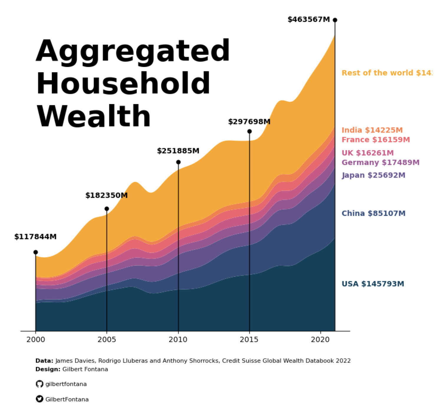
As a teaser, here is the plot we’re gonna try building:

Libraries
For this tutorial, you'll need to install the following librairies:
- matplotlib is the main library used for both graphics and customization.
pandaswill be used to open and manipulate our datasetnumpyandscipyfor smoothing the graph
In case you never used it, remember to install scipy with pip install scipy
# Libraries
import matplotlib.pyplot as plt
import pandas as pd
Load the dataset
If you want to reproduce the results, you can find and download the dataset used on github. Then, you can use the read_excel() function from pandas to read the file since it's in a xlsx format.
Remember to update the my_path variable to where you put the file on your computer.
# Read the Excel file into a DataFrame
my_path = "~/Desktop/python graph gallery"
df = pd.read_excel(f"{my_path}/wealth_data.xlsx")
Basic stacked area plot
Everything start with a basic stacked area chart. You can see many examples in the stacked area chart section of the Python graph gallery, including beginner level tutorials.
The pivot() function will take the original dataframe and transform it into a new table with years as rows, countries as columns, and the total_wealth values at the intersections of years and countries.
Then we use the stackplot function from matplotlib to indicate that we want to create a stacked area chart, with years for the x axis, amounts for the y axis and separated by country (and therefore by column).
# Create a pivot table to reshape the data for stacked area chart
pivot_df = df.pivot(index='year', columns='country', values='total_wealth')

# Plot the stacked area chart with smoothing and custom colors
plt.figure(figsize=(6, 6))  # Set the figure size
plt.stackplot(pivot_df.index,
              pivot_df.values.T,
              labels=pivot_df.columns)
plt.xlabel('Year') # Add a label for the x-axis
plt.ylabel('Total Wealth') # Add a label for the y-axis
plt.title('A Simple Stacked Area Chart') # Add a title
plt.legend(loc='upper left') # Add a legend in the upper left corner of the plot

# Show the plot
plt.show()
Changing the colors and Smoothing the lines
Modifying the colors
In the latter chart, the colors are not very beautiful. You might want to change them to your own colors. In order to do this, you have to define a list of colors of the same length as the number of labels (here it's the number of countries). Then, you just have to put colors=custom_colors when calling the stackplot function.
Smoothing
Smoothed data allows us to better reflect the trend and evolution of data. To smooth the data, we use spline interpolation from scipy. It creates a new set of evenly spaced x values (x_smooth) that span the range of years from the minimum to the maximum year in the data.
It then applies spline interpolation to smooth the total wealth data for each country over these new x values. The result is stored in a new dataframe pivot_smooth.
# Libraries
import numpy as np
from scipy.interpolate import make_interp_spline
# Create a pivot table to reshape the data for stacked area chart
pivot_df = df.pivot(index='year', columns='country', values='total_wealth')
# Define custom colors for the countries
custom_colors = ["#003f5c","#2f4b7c","#665191","#a05195","#d45087","#f95d6a","#ff7c43","#ffa600"]
# Smooth the lines using spline interpolation
x_smooth = np.linspace(pivot_df.index.min(), pivot_df.index.max(), 300)
pivot_smooth = pd.DataFrame({country: make_interp_spline(pivot_df.index, pivot_df[country])(x_smooth)
for country in pivot_df.columns})
# Plot the stacked area chart with smoothing and custom colors
plt.figure(figsize=(6, 6)) # Set the figure size
plt.stackplot(x_smooth,
pivot_smooth.values.T,
labels=pivot_smooth.columns,
colors=custom_colors)
plt.xlabel('Year') # Add a label for the x-axis
plt.ylabel('Total Wealth') # Add a label for the y-axis
plt.title('Stacked Area Chart with Smoothing and Customized Colors') # Add a title
plt.legend(loc='upper left') # Add a legend in the upper left corner of the plot
# Show the plot
plt.show()
Stacking order
Now that you know how to make a stacked area chart with your own colors, let's see how to specify the order of the labels on the chart. It's actually quite simple: you create a list with the order of the labels and adjust your pivot_df in the same order.
# Create a pivot table to reshape the data for stacked area chart
pivot_df = df.pivot(index='year', columns='country', values='total_wealth')

# Define custom colors for the countries
custom_colors = ["#003f5c","#2f4b7c","#665191","#a05195","#d45087","#f95d6a","#ff7c43","#ffa600"]

# Define the desired order of countries
desired_order = ["United States", "China", "Japan", "Germany", "United Kingdom", "France", "India", "Other"]

# Reorder the columns of the pivot_df and custom_colors list
pivot_df = pivot_df[desired_order]

# Smooth the lines using spline interpolation
x_smooth = np.linspace(pivot_df.index.min(), pivot_df.index.max(), 300)
pivot_smooth = pd.DataFrame({country: make_interp_spline(pivot_df.index, pivot_df[country])(x_smooth)
                             for country in pivot_df.columns})

# Plot the stacked area chart with smoothing and custom colors
plt.figure(figsize=(6, 6))  # Set the figure size
plt.stackplot(x_smooth, pivot_smooth.values.T, labels=pivot_smooth.columns, colors=custom_colors)
plt.xlabel('Year')
plt.ylabel('Total Wealth')
plt.title('Stacked Area Chart with Smoothing')
plt.legend(loc='upper left')
plt.show()
Add anotation
This step can take some time, as many of the texts and annotations are added manually. We're mainly using plt.text() function from matplotlib, which makes it super-easy to add text to a graph.
In order to display the Github and Twitter logos at the bottom of the graph, we need to use another library: PIL for opening the image. The latter must be locally stored on the computer: don't forget to download them (any found on the internet will do).
Also, in order to add lines and points, we need to import the cm module from matplotlib.
# Libraries
from PIL import Image # Open the image
import matplotlib.cm as cm # Add annotations (lines and points)
# Create a pivot table to reshape the data for stacked area chart
pivot_df = df.pivot(index='year', columns='country', values='total_wealth')
# Define custom colors for the countries
custom_colors = ["#003f5c","#2f4b7c","#665191","#a05195","#d45087","#f95d6a","#ff7c43","#ffa600"]
# Define the desired order of countries
desired_order = ["United States", "China", "Japan", "Germany", "United Kingdom", "France", "India", "Other"]
# Reorder the columns of the pivot_df and custom_colors list
pivot_df = pivot_df[desired_order]
# Smooth the lines using spline interpolation
x_smooth = np.linspace(pivot_df.index.min(), pivot_df.index.max(), 300)
pivot_smooth = pd.DataFrame({country: make_interp_spline(pivot_df.index, pivot_df[country])(x_smooth)
for country in pivot_df.columns})
# Plot the stacked area chart with smoothing and custom colors
plt.figure(figsize=(8, 8)) # Set the figure size
plt.stackplot(x_smooth, pivot_smooth.values.T, labels=pivot_smooth.columns, colors=custom_colors)
# `plt.gca()` function is used to obtain a reference to the current axes on which you plot your data
ax = plt.gca()
# Annotations for the values per year
def add_annotations_year(year):
"""
Input: a year
Apply: add to the graph the total wealth of all countries at a given date
and a line from the bottom of the graph to the total value of wealth
"""
# Calculate total amount of wealth at a given year
y_end = df[df["year"]==year]["total_wealth"].sum()
# Set values in areas where the graph does not appear
# Special case for 2021: we put it on the left instead of upper the line
if year==2021:
modif_xaxis = -3.3
modif_yaxis = 20000
else:
modif_xaxis = -1.5
modif_yaxis = 26000
# Add the values, with a specific position, in bold, black and a fontsize of 10
plt.text(year+modif_xaxis,
y_end+modif_yaxis,
f'${y_end}M',
fontsize=10,
color='black',
fontweight = 'bold')
# Add line
ax.plot([year, year], # x-axis position
[0, y_end*1.05], # y-axis position (*1.05 is used to make a it little bit longer)
color='black', # Color
linewidth=1) # Width of the line
# Add a point at the top of the line
ax.plot(year, # x-axis position
y_end*1.05, # y-axis position (*1.05 is used to make a it little bit longer)
marker='o', # Style of the point
markersize=5, # Size of the point
color='black') # Color
# Add the line and the values for each of the following years
for year in [2000,2005,2010,2015,2021]:
add_annotations_year(year)
# Annotations for the values per country
def add_annotations_country(country, value_placement, amount, color):
"""
Adds an annotation to a plot at a specific location with information about a country's amount in millions.
Parameters:
country (str): The name of the country for which the annotation is being added.
value_placement (float): The vertical position where the annotation will be placed on the plot.
amount (float): The amount in millions that will be displayed in the annotation.
color (str): The color of the annotation text.
"""
plt.text(2021.5, value_placement, f'{country} ${amount}M', fontsize=10, color=color, fontweight='bold')
# We manually define the labels, values and position that will be displayed on the right of the graph
countries = ['Rest of the world', 'India', 'France', 'UK', 'Germany', 'Japan', 'China', 'USA']
values_placement = [400000, 310000, 295000, 275000, 260000, 240000, 180000, 70000]
amounts = [142841, 14225, 16159, 16261, 17489, 25692, 85107, 145793]
custom_colors.reverse() # Makes sure the colors match the country concerned
# Iterate over all countries and add the name with the right value and color
for country, value, amount, color in zip(countries, values_placement, amounts, custom_colors):
add_annotations_country(country, value, amount, color)
# Title of our graph
plt.text(2000, 320000,
'Aggregated \nHousehold \nWealth', # Title ('\n' allows you to go to the line)
fontsize=40, # High font size for style
color='black',
fontweight = 'bold')
# Credits and data information
plt.text(2000, -50000, 'Data:', fontsize=8, color='black', fontweight = 'bold')
plt.text(2001.4, -50000, 'James Davies, Rodrigo Lluberas and Anthony Shorrocks, Credit Suisse Global Wealth Databook 2022', fontsize=8, color='black')
plt.text(2000, -63000, 'Design:', fontsize=8, color='black', fontweight = 'bold')
plt.text(2001.9, -63000, 'Gilbert Fontana', fontsize=8, color='black')
# Images
def add_logo(path_to_logo, text, image_bottom_left_x, image_bottom_left_y, image_width):
"""
Adds a logo image and text to a plot at specific positions.
Parameters:
path_to_logo (str): The file path to the logo image that will be added to the plot.
text (str): The text to be added along with the logo.
image_bottom_left_x (float): The x-coordinate of the bottom-left corner of the logo image's position on the plot.
image_bottom_left_y (float): The y-coordinate of the bottom-left corner of the logo image's position on the plot.
image_width (float): The width of the logo image in the plot.
"""
logo = Image.open(path_to_logo) # Open the image
image_array = np.array(logo) # Convert to a numpy array
image_height = image_width * image_array.shape[0] / image_array.shape[1] # Calculate height based on ratio
# Add image to graph
ax_image = plt.axes([image_bottom_left_x, # Position on the x-axis
image_bottom_left_y, # Position on the y-axis
image_width, # Image width
image_height]) # Image height
ax_image.imshow(image_array) # Display the image
ax_image.axis('off') # Remove axis of the image in order to improve style
# Add text
plt.text(700, # Position on the x-axis
image_bottom_left_y+500, # Position on the y-axis
text,
fontsize=8,
color='black')
# Add github and twitter credentials
add_logo("github.png", "gilbertfontana", 0.155, -0.03, 0.03)
add_logo("twitter.png", "GilbertFontana", 0.16, -0.06, 0.02)
# Remove the y-axis frame (left, right and top spines)
ax.spines['left'].set_visible(False)
ax.spines['right'].set_visible(False)
ax.spines['top'].set_visible(False)
# Remove the ticks and labels on the y-axis
ax.tick_params(left=False, labelleft=False)
# Display the chart
plt.show()


