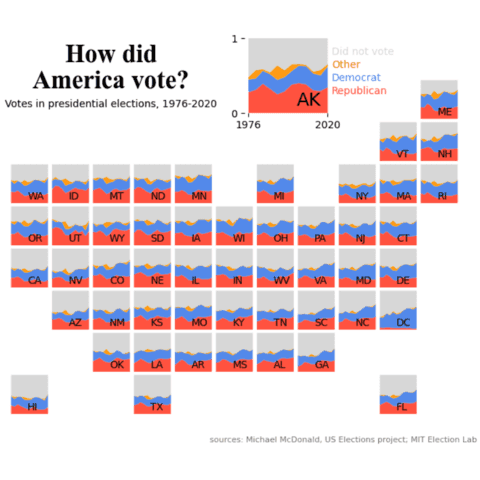
Stacked area Chart
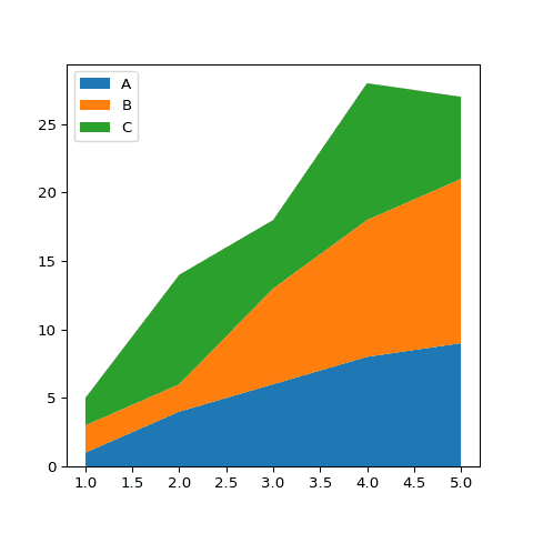
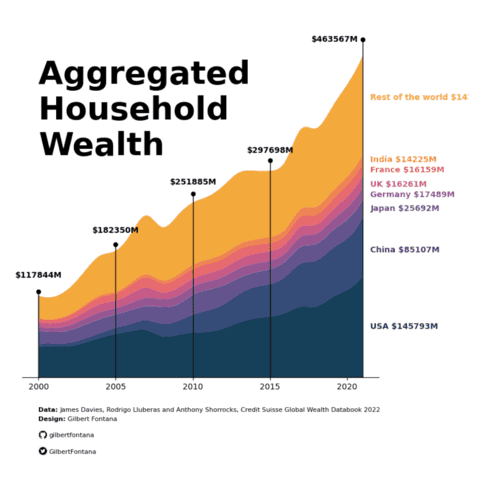
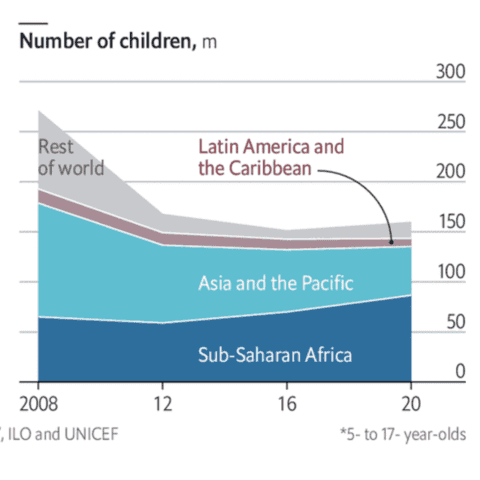
A stacked area chart displays the evolution of a numeric variable for several groups of a dataset. Each group is displayed on top of each other, making it easy to read the evolution of the total, but hard to read each group value accurately. In python, stacked area charts are mainly done thanks to the stackplot() function
⏱ Quick start
Here is a quick start code snippet to demo how the stackplot() function of matplotlib works.
Note that here each groups are provided in its own vector of values. The basic stacked area blog post explains how to use the function from any type of data format.
# library
import numpy as np
import matplotlib.pyplot as plt

# Create data
x=range(1,6)
y1=[1,4,6,8,9]
y2=[2,2,7,10,12]
y3=[2,8,5,10,6]

# Basic stacked area chart.
plt.stackplot(x,y1, y2, y3, labels=['A','B','C'])
plt.legend(loc='upper left')
⚠️ The issue with stacking
Stacked area charts must be used with care since they suffer a number of caveats. They are appropriate to study the evolution of the whole and the relative proportions of each group, but not to study the evolution of each individual group.
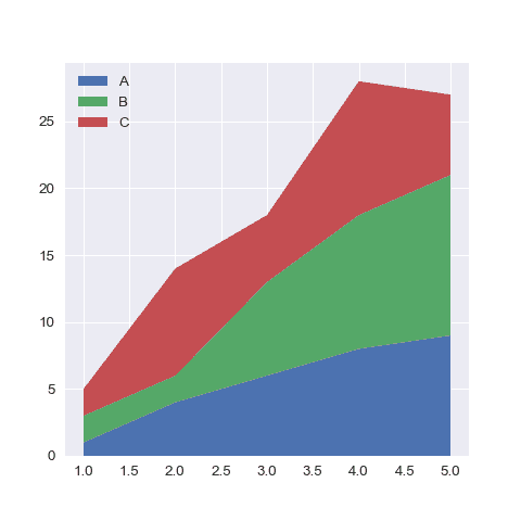
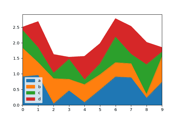
For instance, it is pretty hard to understand how the green group evolves on the chart below. Can you spot if its value is increasing, decreasing or stable?
 Stacked Area chart with
 Matplotlib
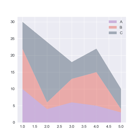
Matplotlib is the most common way to build a stacked area chart with Python. The examples below start by explaining to basics of the stackplot() function. The also describe the most common type of customization like changing colors, controling group order and more.
💡 The baseline parameter
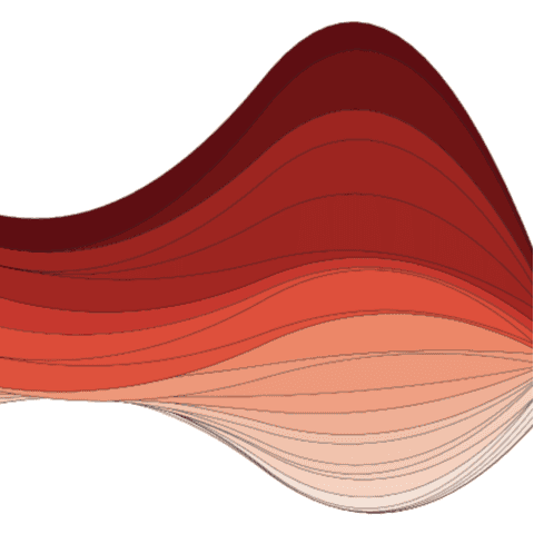
It is important to note that the stackplot() function of matplotlib has abaseline parameter. This parameter controls how groups are displayed around the x axis, what allows to mimic a streamgraph.
 Percent Stacked Area chart with
 Matplotlib
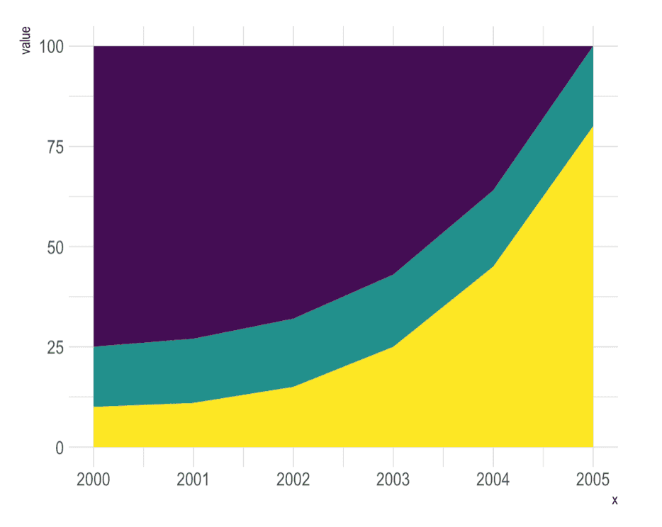
A variation of the stacked area graph is the percent stacked area graph where the value of every groups are normalized at each time stamp. It allows to study the percentage of each group in the whole more efficiently.
Fortunately, the pandas library has a divide() function that allows to apply this normalization easily.
 Stacked Area chart with
 Pandas
Pandas is mainly useful to normalize your dataset and build a stacked area chart. Surprisingly, it also provides a plot.area()that can be handy to build a stacked area chart.
 Best python stacked area chart examples
The web is full of astonishing charts made by awesome bloggers, (often using R). The Python graph gallery tries to display (or translate from R) some of the best creations and explain how their source code works. If you want to display your work here, please drop me a word or even better, submit a Pull Request!
