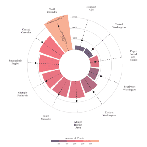
Radar Chart

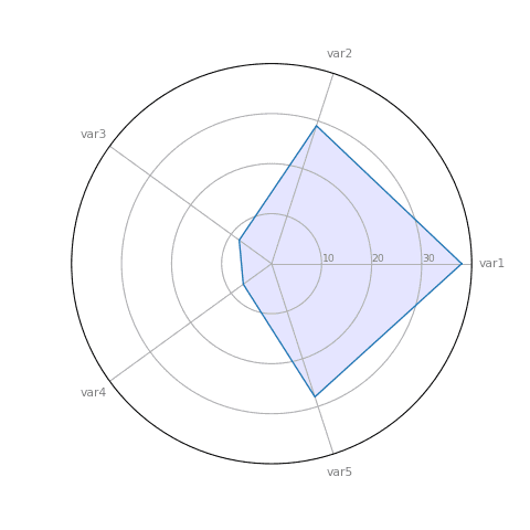
A radar chart (or spider plot, or polar chart) allows to visualize one or more series of values over multiple quantitative variables. Each variable has its own axis, all axes are joined in the center of the figure. This section shows how to build it with Matplotlib, but keep in mind they are some caveats associated with this chart type.
⚠️ Radar charts are criticized
Spider plots are somewhat criticized. The variable order has a huge impact on the chart appearance, scales can be skewed, overplotting makes it hard to read and over-evaluation of differences are the main arguments.
You should probably read this article that explains the issues more in depth before building one, and consider switching to one of the alternative below:
 Radar chart with
 Matplotlib
As far as I know there isn't any library offering a function to build a spider plot quickly. Fortunately, Matplotlib allows a very high level of customization. With a bit of trigonometry and the plot() function you should get your desired viz.
Radar charts are often used in combination with faceting. It allows to compare the features of several groups, what would be unreadable if plotted on the same chart.

A polar chart with small multiple to compare 4 groups
 Radar chart with
 Plotly
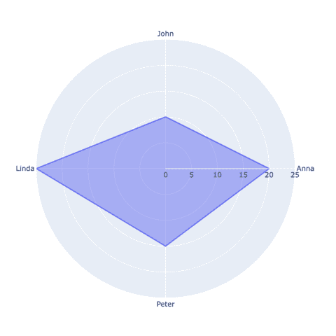
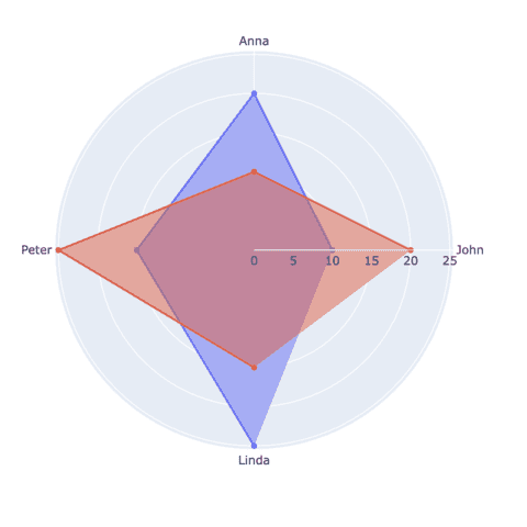
Plotly is a great library to build radar charts. It offers a high level of interactivity and can be used with bothplotly express and plotly graph objects.
 Best python radar chart examples
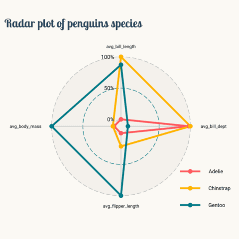
The web is full of astonishing charts made by awesome bloggers, (often using R). The Python graph gallery tries to display (or translate from R) some of the best creations and explain how their source code works. If you want to display your work here, please drop me a word or even better, submit a Pull Request!
🚨 Grab the Data To Viz poster!
Do you know all the chart types? Do you know which one you should pick? I made a decision tree that answers those questions. You can download it for free!


