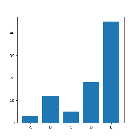
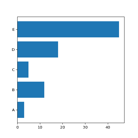
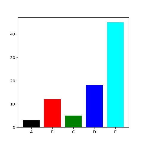
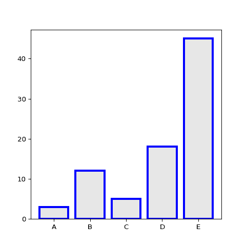
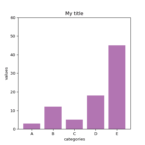
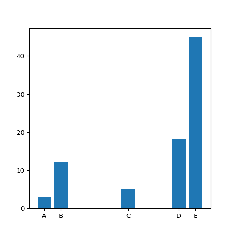
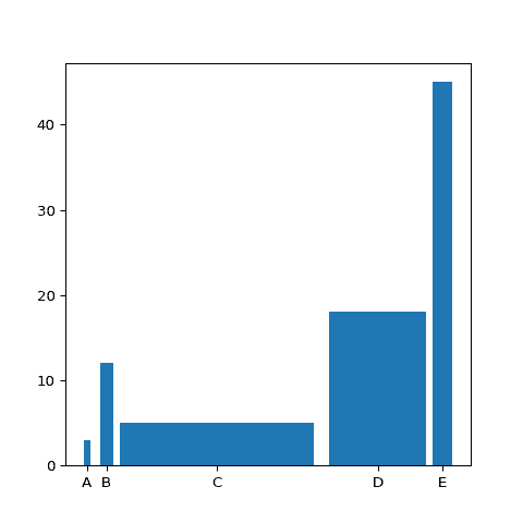
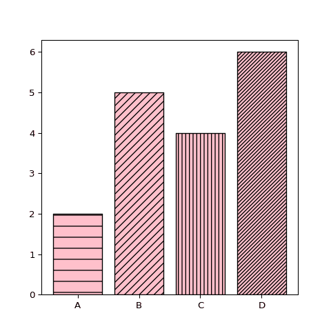
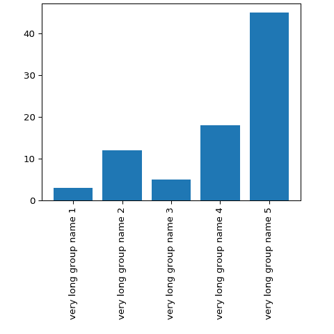
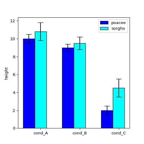
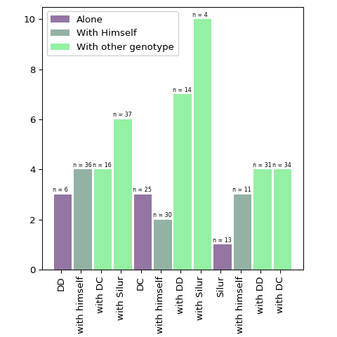
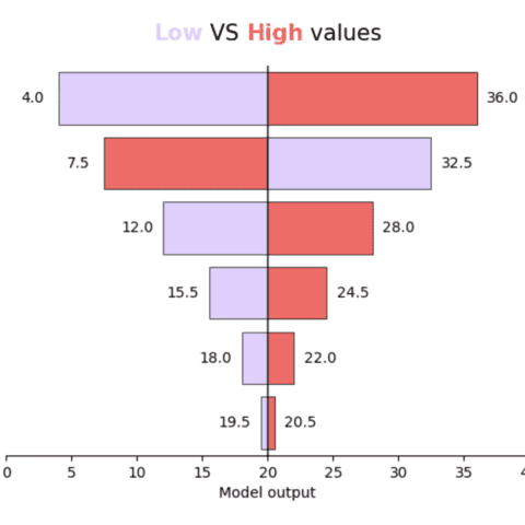
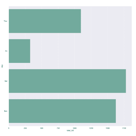
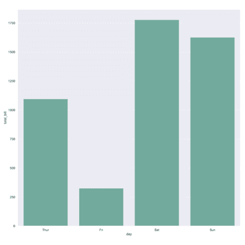
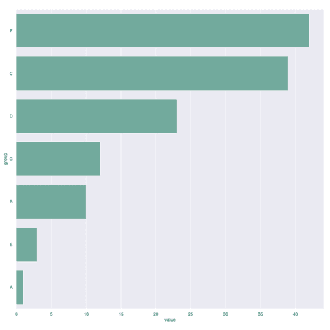
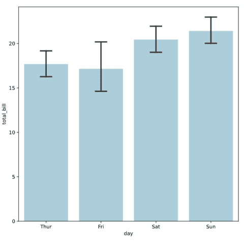
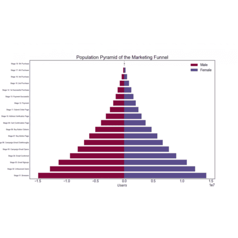
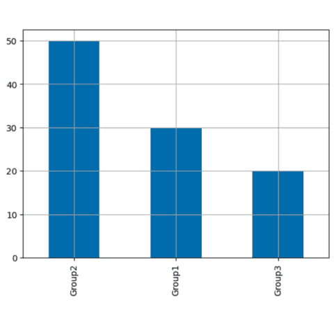
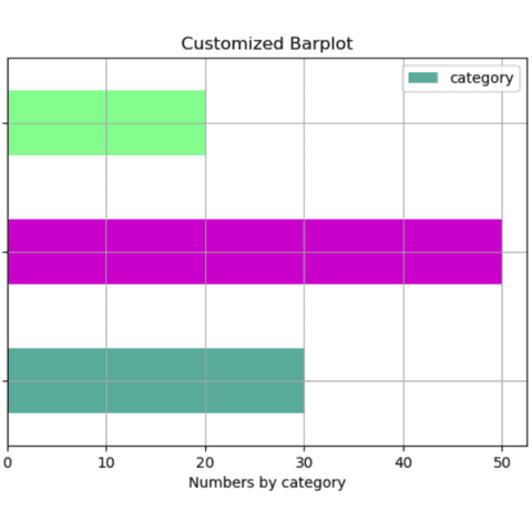
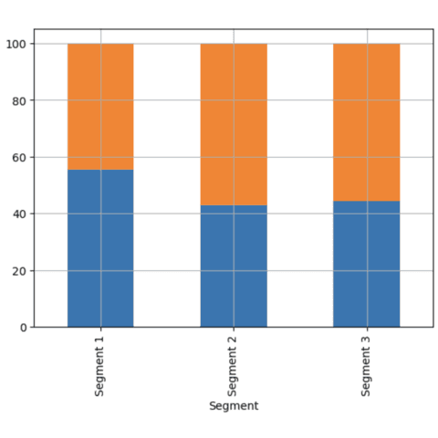
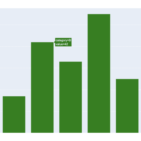
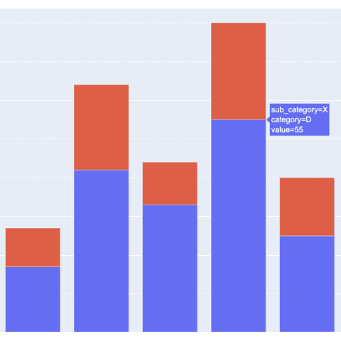
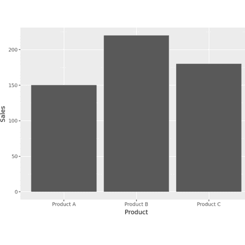
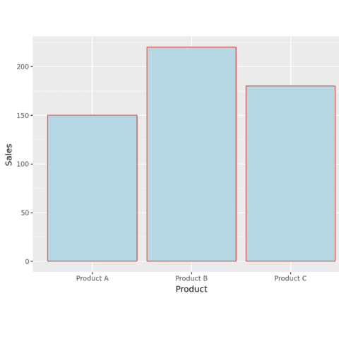
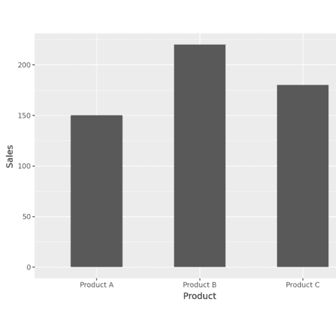
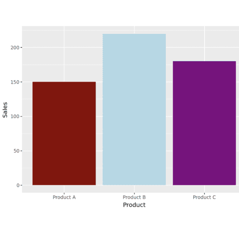
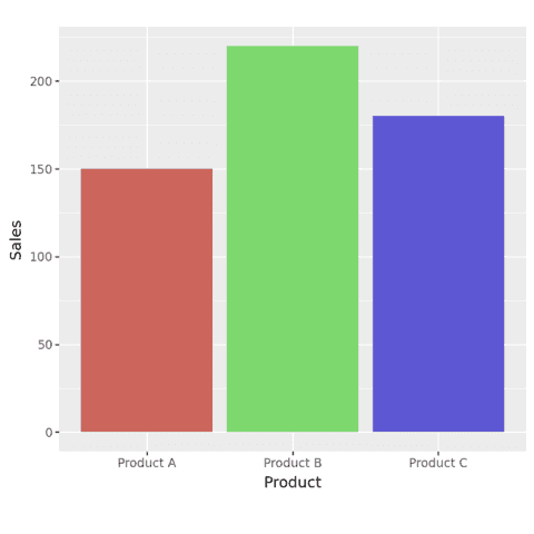
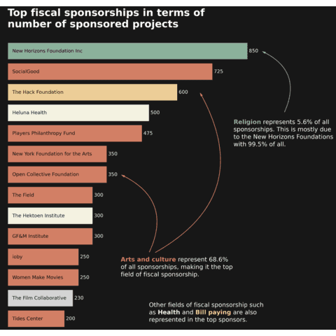
A barplot shows the relationship between a numeric and a categoric variable. Each entity of the categoric variable is represented as a bar. The size of the bar represents its numeric value.
This section shows how to build a barplot with Python, using libraries like Matplotlib and Seaborn. It start by explaining how to build a very basic barplot, and then provides tutorials for more customized versions.
Note that this page also provides guidelines on how to build stacked and grouped barplot, 2 common variatons useful when several levels of grouping are available.
⏱ Quick start
Matplotlib is pretty convenient to build a barplot thanks to its bar() function. Seaborn works perfectly as well, see its dedicated section.🔥
# Libraries
import numpy as np
import matplotlib.pyplot as plt

# Make a random dataset:
height = [3, 12, 5, 18, 45]
bars = ('A', 'B', 'C', 'D', 'E')
y_pos = np.arange(len(bars))

# Create bars
plt.bar(y_pos, height)

# Create names on the x-axis
plt.xticks(y_pos, bars)

# Show graphic
plt.show()
 Barplot with
 Matplotlib
Matplotlib is probably the most famous and flexible python library for data visualization. It is appropriate to build any kind of chart, including the barchart thanks to its bar() function.
The examples below should get you started. They go from basic examples to the details on how to customize a barplot appropriately.
 Barplot with
 Seaborn
Seaborn is definitely a good alternative to Matplotlib to build a barplot. It comes with a barplot() function that will get you started in minutes.
As often, note that the Seaborn alternative allows to write less code to build the chart, but is slighlty more limited in term of customization
 Stacked and Grouped barplot with
 Matplotlib
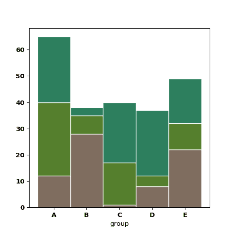
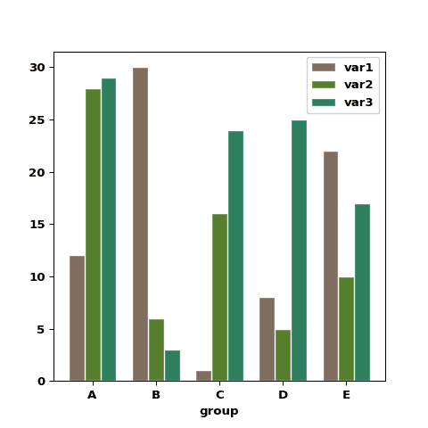
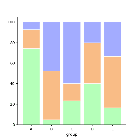
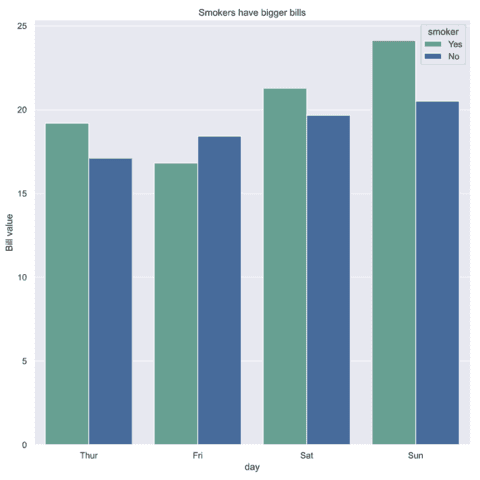
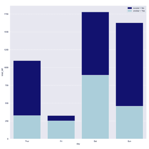
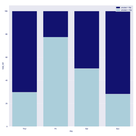
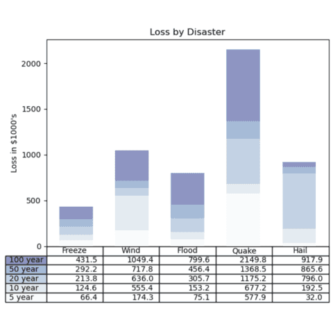
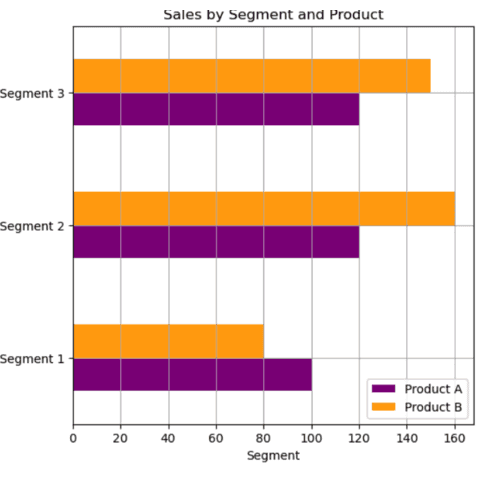
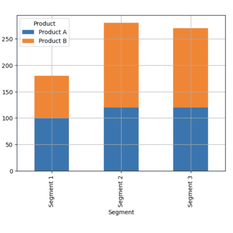
Stacked and Grouped barplots are a variation of the more simple barplot. They display the value of a numeric variable for each group and subgroups of a dataset. Subgroups can be stacked (stacked barplot) or set one beside the other (grouped barplot).
The three examples below are in-depth tutorial explaining how to build them with Python.
 Stacked and Grouped barplot with
 Seaborn
The barplot() function of seaborn allows to quickly build a grouped barplot. You just have to pass the column used for subgrouping to the hue parameter.
It gets a bit more tricky for stacked and percent stacked barplot, but the examples below should hopefully help.
 Barplot with
 Pandas
The bar() function of pandas allows to quickly build a barplot. You will find below examples of how to create simple and grouped barcharts using pandas.
 Barplot with
 Plotly
The Plotly provides 2 ways to build a barplot. The first one is to use the plotly express module for fast and interactive barplots. The second one is to use the graph objects module for more advanced customization.
The examples below explains both methods.
 Barplot with
 Plotnine
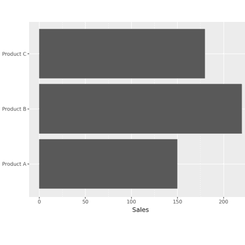
The plotnine library is a great alternative to build barplots. It is based on the grammar of graphics, like ggplot2 in R.
The examples below should get you started. They go from very simple examples and how to customize them.
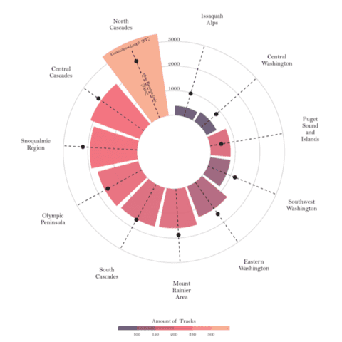
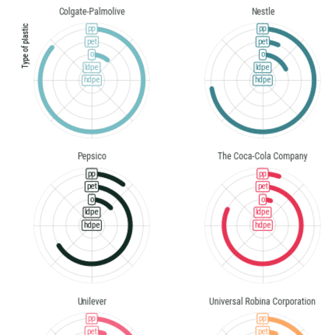
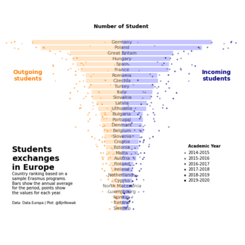
 Best python barplot examples
The web is full of astonishing charts made by awesome bloggers, (often using R). The Python graph gallery tries to display (or translate from R) some of the best creations and explain how their source code works. If you want to display your work here, please drop me a word or even better, submit a Pull Request!

